
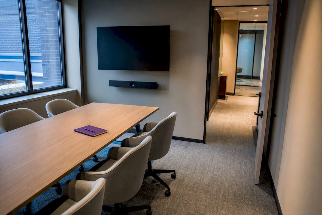
Plan for roughly 1.8–2.3 m² (20–25 sq ft) per person for a standard seated meeting, then adjust for layout and add allowance for AV and circulation. Use huddle rooms (2–4 people), small rooms (6–10), medium rooms (10–16) and large or training rooms (16+) as your planning categories. The sections below break each of those down into metric dimensions, clearances and layout rules you can drop straight into a floor plan.
TL;DR:
- Rooms for 8 to 12 people should be between 8 and 15 m² to ensure comfort and proper circulation, not just capacity on paper.
- Choose the layout first—such as U-shape or classroom—since it significantly influences space per person, adding 10 to 20% for AV and circulation.
- Maintain at least 760 mm clearance behind chairs and 900 mm for aisles to meet basic usability and accessibility standards.
- Ensure ceiling heights are at least 2.7 m in small to medium rooms and 3.0 m or higher in larger or training spaces for acoustics and visual comfort.
- Select furniture that does not reduce effective capacity, considering built-in elements and bulkier chairs that may lower seat count despite ample floor area.
Table of Contents
- Meeting room size by capacity: recommended area ranges
- How layout changes space per person
- Clearances, circulation and accessibility
- Sample room plans you can copy into a floor plan
- AV, sightlines and screen distance
- Designer notes from the design team
- Ceiling height and comfortable room volume
- Acoustic treatment by room size
- Lighting requirements by room size and layout
- HVAC and ventilation by occupancy
- Furniture size and effective capacity
- Sources
Meeting room size by capacity: recommended area ranges
Room size should follow capacity, not the other way round. A room built for 8 people that regularly hosts 12 will feel cramped no matter how good the furniture is, and a room sized for 20 that mostly hosts 6 wastes square metres you could use elsewhere in the floor plan.
Working from the Meeting Room Doctor’s metric bands, here’s how capacity typically maps to floor area:
- Focus/phone booths (1–2 people): 2–4 m² — barely bigger than a wardrobe, but enough for a private call
- Huddle rooms (2–4 people): 4–8 m² — a small table and two to four chairs, no room for a wall screen without tight sightlines
- Small meeting rooms (6–10 people): 8–15 m² — the workhorse size for most offices
- Medium rooms (10–16 people): 15–30 m² — enough for a boardroom table plus a side credenza
- Large rooms (16–20+ people): 30–50 m² — usually boardroom or classroom style with a presenter zone
- XL/training rooms (20+ people): 50 m²+ — theatre or classroom seating, often reconfigurable
That extra space isn’t padding. It’s the difference between a room that works on paper and one that works when twelve people, a trolley of coffee cups and a video cart all need to move through it at once.
Treat the manufacturer or architect’s stated capacity as a hard ceiling, not a target. A “12 person” boardroom table seats twelve only if nobody needs to lean back, plug in a laptop, or push their chair out to leave early.
How layout changes space per person
Capacity numbers mean nothing until you’ve picked a layout, because the same headcount can demand wildly different floor areas depending on how people sit. Room-size calculators built on ANSI/BIFMA-style methodology apply different per-person figures for exactly this reason.
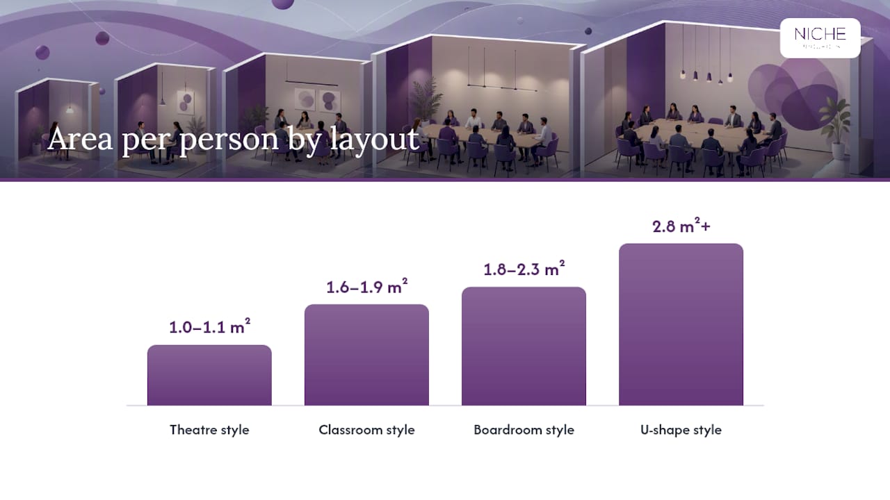
- Theatre style — around 1.0–1.1 m² per person. Rows of chairs, no tables, minimal circulation. Good for briefings and all-hands updates where nobody needs to write.
- Classroom style — around 1.6–1.9 m² per person. Tables plus chairs for note-taking, with aisles between rows. Suits training sessions and workshops with a slide deck.
- Boardroom style — around 1.8–2.3 m² per person. A single table, chairs around the perimeter, generous circulation behind each seat. The default for decision-making meetings.
- U-shape style — 2.8 m²+ per person. Tables arranged in a U with open floor in the middle for a presenter to move through. Best for interactive workshops and facilitated discussions.
The formula is simple: multiply headcount by the per-person figure for your chosen layout, then add 10 to 20% for AV equipment, doorways and circulation space.
Pro Tip: Pick the layout before you calculate area, not after. Teams routinely lock in a room size first, then discover the layout they actually want (usually U-shape or cabaret for workshops) simply doesn’t fit — and end up cramming a boardroom table into a space that needed open floor.
Clearances, circulation and accessibility
The measurements that make a meeting room genuinely usable rarely show up on a furniture spec sheet, but skip them and the room fails the moment it’s occupied.
National Business Furniture’s planning guidance sets out the clearance figures that matter most:
- Behind each chair: 760–900 mm minimum so a seated person can push back without hitting the wall; 900–1,200 mm is more comfortable, especially if people need to stand and exit mid-meeting
- Table edge per person: roughly 600 mm of table width, enough for a laptop and a notepad side by side
- Main aisles and doorways: keep a clear path of at least 900 mm, and check local accessibility codes for wheelchair turning circles, which commonly require around 1,500 mm of clear diameter
A room with 20–25 sq ft per person on paper can still fail a basic usability test if the chair clearance behind the back row is under 760 mm — the maths adds up, but nobody can actually get out of their seat.
Accessibility requirements vary by jurisdiction, so confirm the applicable building code for your project rather than relying on a rule of thumb alone. Good accessible furniture design also accounts for door swing directions, AV cupboard placement and where a presenter needs to stand without blocking the main thoroughfare.
Sample room plans you can copy into a floor plan
Concrete footprints save more design time than any rule of thumb, because they let you sanity check a layout before committing to it on paper. These are metric-ready starting points, not fixed specifications.
- 4 people: roughly 3.0 m × 3.0 m (9 m²), 1,200 mm round or square table, 900 mm clearance on each side
- 6 people: roughly 3.6 m × 3.6 m (13 m²), 1,800 mm × 900 mm rectangular table
- 8 people: roughly 4.2 m × 4.2 m (17.5 m²), 2,400 mm × 1,000 mm table
- 10 to 12 people: roughly 5.5 m × 4.0 m to 8.2 m × 4.6 m (22 to 38 m²), based on medium rectangle room dimension standards
- 16 people: roughly 8.0 m × 5.0 m (40 m²), often split into a boardroom table plus a side breakout zone
- 20+ people: 50 m² or more, typically classroom or theatre seating with a dedicated presenter area
For hybrid meetings, add 10 to 20% extra floor area to accommodate a camera zone at the far end of the table and a clear space in front of any ceiling microphone array. A 2.7 m standard ceiling works fine for rooms up to medium size, but anything pushing towards XL or training-room scale benefits from higher ceilings, which we cover next.
AV, sightlines and screen distance
Where people sit should be dictated by where they can actually see the screen, not by how many chairs fit around the table. Screen viewing distance guidance generally recommends the back row sit no further than 1.5 to 3 times the screen height from the display, depending on content resolution.
- For a 1.5 m tall screen, keep the furthest seat within roughly 2.25 to 4.5 m to maintain legible text and clear video calls
- Test sightlines by sitting in every seat during the design phase, not just the ones closest to the table centre
- Mount ceiling microphones and cameras away from door swings and circulation paths so nobody clips them walking past
- Reserve a presenter zone of at least 1.2 m depth at the front of the room, and if you’re adding a whiteboard wall, subtract that footprint from the usable occupant area before finalising chair count
Skipping this step is how rooms end up seating twelve people on paper while only eight can actually read the screen.
Designer notes from the design team
Experienced design teams have walked clients through meeting room briefs to know the sizing charts only get you halfway. The real decision is which trade-off to prioritise: capacity, comfort, AV performance or budget, because you rarely get all four in a tight floor plan.
Our rule of thumb: prioritise comfort and circulation over squeezing in extra seats. A room that seats ten comfortably outperforms one that seats fourteen at the cost of clearance and sightlines, every time it’s actually used.
If you’re translating these numbers into a real brief, our free office space plan tool and pre-design checklist are built for exactly this stage of a project.
Ceiling height and comfortable room volume
Floor area gets most of the attention, but ceiling height determines whether a correctly sized room actually feels comfortable. A 15 m² room with a 2.4 m ceiling has a different feel entirely to the same footprint under a 3.0 m ceiling, even though the seating capacity on paper is identical.
Low ceilings compress a room acoustically and visually, which matters more as headcount rises. A huddle room for four can work fine at standard 2.4–2.7 m ceiling height, since sound has nowhere far to travel and there’s rarely a wall-mounted screen high enough to need extra clearance. Push past ten or twelve people, though, and a low ceiling starts working against you: voices bounce harder off a flat surface close overhead, and any raised screen or projector needs more headroom to sit above sightlines without forcing the back row to duck below a beam.
As a planning guide, aim for 2.7 m minimum in small and medium rooms, and 3.0 m or higher in large and training rooms, particularly where the room might host standing presentations or tiered AV screens. Rooms with exposed services, ducting or structural beams need the clear height measured beneath those elements, not to the underside of the slab. If your building’s floor to floor height only allows 2.4 m clear in a proposed large room, it’s often better to reduce the occupant capacity than fight the volume with acoustic treatment alone.
Acoustic treatment by room size
Acoustic requirements scale with room volume, not just floor area, because sound behaves differently in a small enclosed box than it does in a large open one. A 9 m² huddle room with hard walls and a glass door will produce noticeable echo on a video call even with only two people in it, simply because there’s so little soft material to absorb reflections.
Small rooms benefit most from a single acoustic panel or fabric wall behind the primary camera position, paired with a carpeted or soft-tiled floor. That’s usually enough to stop the “boxy” sound that plagues glass-walled huddle rooms in open-plan offices.
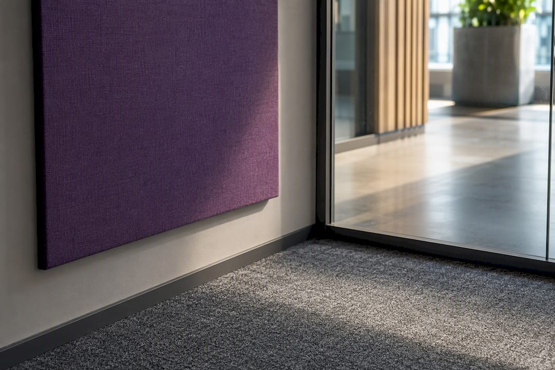
Medium and large rooms need a more distributed approach: acoustic ceiling tiles across at least half the ceiling area, plus wall panels on at least one long wall opposite any hard glazing. Rooms running 30 m² or larger, especially training and XL spaces with theatre or classroom seating, often need a reverberation time assessment as part of the design brief, because these larger volumes are exactly where speech intelligibility problems show up most in post-occupancy feedback. Full-height glass partitions, popular for natural light, are also the single biggest acoustic liability in open-plan meeting rooms and usually need a compensating treatment elsewhere in the room.
Lighting requirements by room size and layout
Lighting has to do two competing jobs in a meeting room: make the space feel comfortable to sit in for an hour, and make people look correctly lit on a video call. Getting the balance wrong is one of the most common complaints in hybrid meeting spaces.
Small and huddle rooms need even, diffused light with minimal harsh shadows, since cameras sit close to occupants and any overhead downlight creates unflattering shadows under the eyes. Layered lighting, a mix of ceiling ambient light and softer task lighting near the table, solves this better than a single bright ceiling fixture.
Medium and large rooms carry a bigger challenge: balancing ambient light for the room with controlled light near any presentation screen, where too much brightness washes out the display. Dimmable zones matter here, ideally split so the presenter and screen area can be dimmed independently from the seating area. In classroom and theatre layouts, avoid placing bright downlights directly behind where a presenter will stand, since that backlights them against the camera and undermines the whole point of good AV.
Natural light is worth prioritising in small and medium rooms where blinds or adjustable glazing can manage glare, but XL training rooms with fixed screens generally perform better with controlled artificial light and minimal direct daylight on the presentation wall.
HVAC and ventilation by occupancy
Air quality and temperature control need to scale with occupant density, not just room size, because a fully seated meeting room generates far more heat and CO2 load per square metre than the same space sitting empty. A 15 m² room comfortable for two people working quietly can feel stuffy within twenty minutes once ten people and a running laptop cart are packed into it.
As a planning principle, ventilation capacity should be sized against the maximum stated occupancy of the room, not an average expected attendance. Rooms that regularly host their full rated capacity, training rooms especially, need dedicated fresh air supply or a higher air change rate than a standard open-plan HVAC zone provides, since shared building systems often can’t respond quickly enough to a room going from empty to full in minutes.
Glass-walled meeting rooms, common in modern fit-outs, add a further complication: they trap solar heat gain in a way that plasterboard walls don’t, which pushes cooling load higher than the floor area alone would suggest. If a room sits on a north or west-facing facade, factor that into HVAC sizing rather than relying on the same per-square-metre assumption used for internal rooms.
Where a building’s base HVAC can’t be adjusted room by room, supplementary extraction or a standalone unit is often the more practical fix than trying to oversize the room to compensate for poor airflow.
Furniture size and effective capacity
The table and chairs you specify can shrink a room’s effective capacity well below what the floor area alone suggests, which is why two rooms with identical footprints can comfortably seat different numbers of people.
A boardroom table with a wide central base or built-in cable trough often can’t seat people directly at its corners, quietly cutting capacity by two seats compared to a simple rectangular table of the same length. Bulky executive chairs with high backs and arms need more of that 600 mm per-person table allowance than a standard task chair, so swapping furniture after a room is designed can turn a comfortable ten-seat table into a cramped eight-seat one.
Fixed furniture, built-in credenzas, wall-mounted AV racks, permanent whiteboards, also eats into usable floor area in a way that’s easy to miss on a furniture plan drawn before construction. Modular and foldaway furniture recovers some of that lost capacity in rooms that need to flex between layouts, letting a room built for U-shape workshops convert to theatre seating for an all-hands without a full refit. When specifying furniture for any room near its area ceiling, measure the actual chair and table footprint rather than relying on manufacturer capacity claims, which often assume slimmer chairs than most offices actually buy.
If you’re weighing furniture choices against layout flexibility, our guide on which office layout suits your business covers how furniture decisions ripple through the rest of a floor plan.
Turning these numbers into a working brief is where most projects stall, and it’s exactly the gap Niche Projects fills for clients moving from a rough capacity target to a finished room. If you’re planning a fit-out or refurbishment and want the sizing worked through against your actual floor plate, our ergonomic office design service handles the detail from first sketch to construction.