
Space utilisation analysis measures how much of your workspace actually gets used, tracked as a trend over weeks rather than a single occupancy count. The first move is a 2 to 4 week study that layers booking, badge, and sensor data, then focuses on your busiest 15 minute windows rather than daily averages. Get that right and you cut wasted floor space and cost while giving staff rooms that are actually available when they need them.
TL;DR:
- Peak utilisation figures above 85% indicate the need for more meeting spaces, while below 40% suggest consolidation opportunities; averages can mislead capacity decisions.
- Conduct a 2- to 4-week study focusing on the busiest 15-minute windows to accurately capture demand peaks without distortion from short-term fluctuations.
- Reconcile multiple data sources weekly, including booking logs, badge data, and sensor readings, to identify gaps like ghost bookings or badge-only overstatements.
- Prioritize small, reversible space adjustments such as splitting oversized rooms or adding phone booths before costly renovations.
- Use benchmarking data showing an average peak utilisation of around 25% in 2025 to set realistic, location-specific targets rather than industry-wide generic goals.
Table of Contents
- What are the key space utilisation metrics and formulas?
- How do you design a utilisation study that holds up?
- What do the results actually mean, and what’s a good benchmark?
- What are the highest-value optimisation moves?
- What tools and privacy rules should you know before collecting data?
- How does Niche Projects apply this in practice?
- How long does a utilisation study take, and what does it cost?
- What pitfalls trip up most utilisation studies?
- How does this connect to workplace strategy and employee experience?
- Where can you check the benchmarks and methodology yourself?
- Get a tailored view of your own space with Nicheprojects
- Sources
What are the key space utilisation metrics and formulas?
Utilisation rate is the core number: the percentage of available seats or rooms actually occupied during working hours. It’s calculated as occupied seat time divided by available seat time, multiplied by 100.
Occupancy is different, and mixing the two up is the most common mistake facility teams make. Occupancy is a headcount at a single moment. Utilisation is that headcount tracked across a defined period, which is why industry analysts frame utilisation as a trend rather than a snapshot — a Tuesday 11am occupancy reading tells you almost nothing on its own.
The other metrics you need alongside utilisation rate:
- Peak utilisation: the highest occupancy percentage recorded in any measurement interval, usually the number that should drive your sizing decisions.
- Booking rate: the share of bookable spaces reserved through your system, regardless of whether anyone showed up.
- No-show rate: bookings made but never used, a strong signal of ghost booking behaviour.
- Mobility ratio: the proportion of staff who move between desks or zones during a typical week, which shapes how many assigned versus shared seats you need.
- Cost per seat: total occupancy cost (rent, fit-out amortisation, services) divided by seat count, the number that turns utilisation data into a business case.
Pro Tip: Calculate cost per seat against your peak utilisation figure, not your average. That one substitution often reveals a portfolio is 30 to 40 percent bigger than it needs to be.
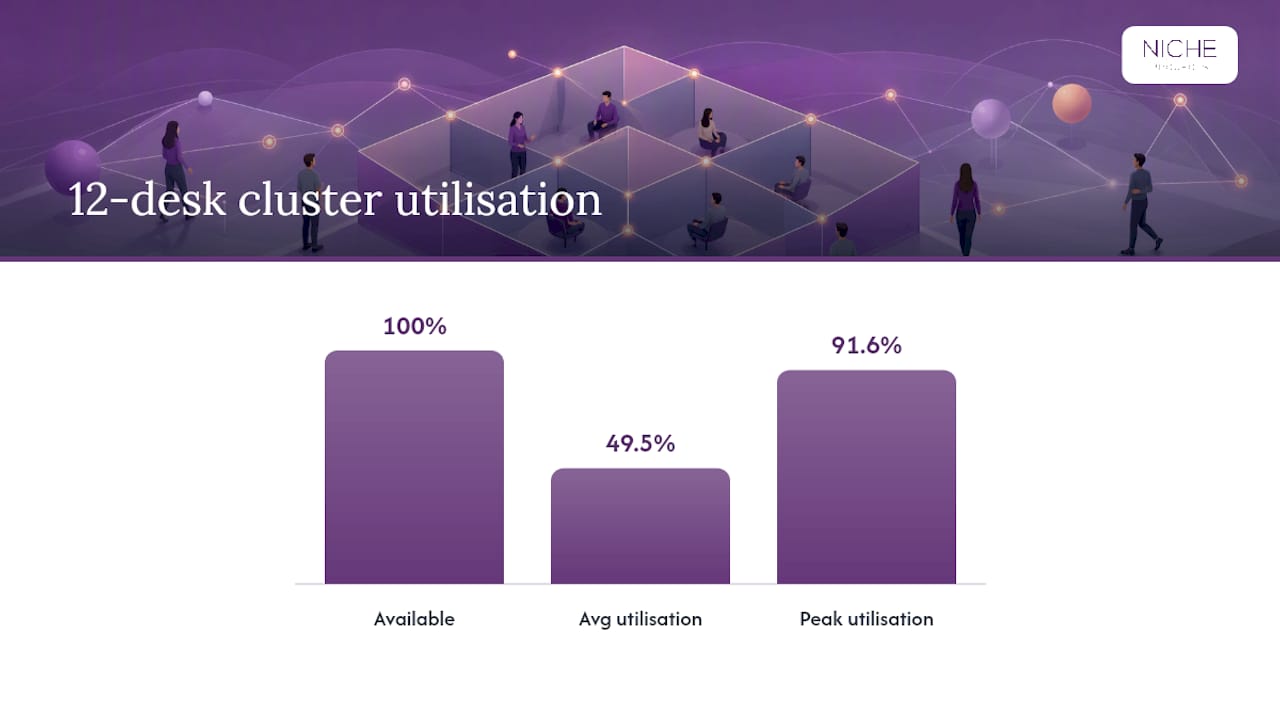
Here’s a worked example. A 12 desk cluster is measured across 20 working days, 8 working hours each. Total available desk hours: 12 × 20 × 8 = 1,920. Sensors log 950 occupied desk hours across the period. That gap between 49.5% average and 91.6% peak is exactly why averages mislead sizing decisions, and it’s the number that should inform whether you add a small huddle room nearby rather than cut desks from that cluster.
How do you design a utilisation study that holds up?
Start narrow. Pick a defined scope, a single floor, a room type, or one desk neighbourhood, rather than trying to instrument an entire portfolio in one pass.
- Set the scope. Choose building, floor, room category, or desk cluster based on where the decision actually needs to be made.
- Run for 2 to 4 weeks. This window captures weekday variation and avoids one bad Monday skewing your results, while staying short enough to act on findings quickly.
- Measure in 15 minute intervals. Modelling capacity against the busiest 15 minute windows rather than daily averages avoids designs that fail exactly when demand peaks.
- Place sensors or checkpoints for coverage, not convenience. Corners, huddle rooms and phone booths need direct line of sight; don’t cluster sensors only where installation is easy.
- Reconcile feeds weekly. Compare booking data, badge logs, sensor counts and a manual spot check against each other, and flag any variance above 15 to 20 percent for investigation.
Pro Tip: Run your manual spot checks on a Tuesday or Wednesday between 10am and 2pm. That window is where shortage patterns concentrate most reliably, and it’s the fastest way to sanity-check your sensor data against reality.
What do the results actually mean, and what’s a good benchmark?
Peaks drive layout decisions; averages drive cost conversations. Confusing the two leads to two different failures: sizing a floor for its average (and running out of meeting rooms every Tuesday) or sizing for its peak everywhere (and paying for permanently empty space the other four days).
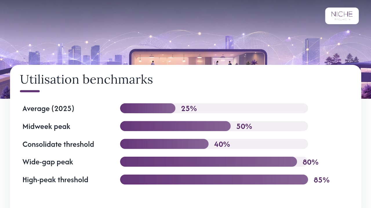
The most useful published benchmark right now: average workplace peak utilisation sat around 25% in 2025, even though midweek peaks in individual buildings can run double that figure. That’s a striking gap, and it’s the reason blanket “aim for 70% utilisation” advice floating around the industry falls apart in practice, since it rarely specifies whether that’s a peak or average figure, or over what window it was measured.
Treat these as directional thresholds rather than hard rules, since local variance by industry, building type and work pattern is real:
- Peak utilisation consistently above 85% in a room category signals you need more of that room type, not fewer.
- Peak utilisation consistently below 40% across a desk neighbourhood or floor points toward consolidation or repurposing.
- A wide average-to-peak gap (say, 30% average against 80% peak) usually means the room mix is wrong, not the total square metreage.
Heatmaps and time-of-day charts are the fastest way to validate a conclusion before you act on it. A heatmap that shows uniform low use across a floor supports consolidation; one that shows a sharp midweek spike in one zone points to smoothing demand rather than cutting capacity there.
What are the highest-value optimisation moves?
Start with changes you can reverse. The biggest mistake in this phase is committing to a full refit before testing whether a smaller change solves the problem.
- Convert oversized rooms. A 10-person boardroom that averages 3 attendees is a candidate for splitting into two smaller huddle rooms or phone booths, a move that usually lifts both utilisation and availability at once.
- Add small-format spaces where mobility is high. If your mobility ratio shows heavy movement between zones, phone booths and 2 to 4 person rooms typically absorb that demand better than more open desks.
- Adjust booking and check-in policy. Requiring check-in within 10 to 15 minutes of a booking start, and auto-releasing no-shows, directly reduces ghost bookings without spending on hardware.
- Smooth demand across the week. Staggered anchor days or team-based scheduling reduce the Tuesday to Thursday crunch that skews most utilisation studies.
- Introduce flexible furniture. Modular desks and movable partitions let you respond to what the data shows without a construction project every time usage patterns shift, a point covered in more depth in the case for flexible furniture.
- Pilot before you commit. Converting one or two oversized rooms and measuring the seat-minute impact over a few weeks before rolling changes across a floor keeps risk low and gives you real before-and-after numbers to justify the next stage. Practical tactics for this kind of staged repurposing are covered in making the most of your office space.
What tools and privacy rules should you know before collecting data?
Tool choice matters less than most vendors suggest, and it comes down to four categories: workplace analytics platforms (dashboards over your combined feeds), IWMS systems (integrated facility and asset management), occupancy sensors, booking platforms, and digital twin tools for visualisation. Starting with the data you already generate, booking logs and badge records, then adding sensors where gaps show up, avoids paying for full instrumentation before you know it’s needed.
Privacy needs to be built in from day one, not retrofitted after staff notice the sensors. Three basics matter most:
- Anonymise presence data at the point of collection wherever the analysis doesn’t require individual identification.
- Minimise retention and set a clear deletion schedule rather than storing raw feeds indefinitely.
- Communicate purpose to staff before rollout and follow the privacy obligations that apply in your jurisdiction.
For integration, insist on canonical space naming across every system, synchronised clocks between sensors and booking platforms, and a consistent definition of what counts as an “occupancy window” before you start comparing feeds against each other.
How does Niche Projects apply this in practice?
- Scope defined before any data collection began, avoiding wasted sensor spend on low-priority zones.
- Multiple feeds reconciled weekly against manual spot checks.
- Room mix changes piloted on one floor before wider rollout.
If you want the same structure applied to your own floor plan, Nicheprojects offers a free office space plan as the starting point.
How long does a utilisation study take, and what does it cost?
A first-pass study built on booking and badge data alone, no sensor hardware, can be running within a week and produce usable findings within the standard 2 to 4 week window. That’s the fastest, lowest-cost entry point, and it’s often enough to identify obvious problems like a chronically underused boardroom or a desk neighbourhood nobody visits on Mondays.
Adding sensors extends the timeline. Procurement, installation and calibration typically add 2 to 4 weeks before data collection even starts, pushing a sensor-inclusive study to 6 to 10 weeks end to end. Cost scales with the number of sensor points and the complexity of the space; a single floor pilot is a modest outlay compared to instrumenting an entire portfolio, which is exactly why starting narrow makes financial sense as well as analytical sense.
Effort on your side is often underestimated. Someone needs to own weekly data reconciliation, chase down anomalies between feeds, and translate raw numbers into the kind of heatmaps and threshold comparisons leadership can act on. Budget for that internal time as seriously as you budget for any sensor hardware, because a study with clean data and no one to interpret it produces nothing but a spreadsheet nobody reads.
If the study points toward a physical change, room conversions, desk reconfiguration, or a full re-plan, assessing your needs before an office fit out is the natural next step once your utilisation findings are validated.
What pitfalls trip up most utilisation studies?
The most common failure is measuring too short a window and mistaking a quiet fortnight for a permanent trend. A 2 to 4 week study run over a holiday period or during a run of sick leave will understate real demand, so check your measurement window against the calendar before you draw conclusions.
The second is trusting a single data source. Badge data alone overstates desk occupancy because it confirms building entry, not desk use; booking data alone overstates room demand because it never accounts for no-shows. Teams that skip reconciliation routinely act on numbers that are wrong in a specific, predictable direction.
A third pitfall is designing around averages instead of peaks, which produces a floor that looks efficient on paper and fails visibly every Tuesday afternoon when three teams all need a meeting room at once. Averages are useful for cost conversations; they’re the wrong number for capacity decisions.
Finally, plenty of studies stall because nobody owns the follow-through. Data collection happens, a report gets written, and then nothing changes because no one translated findings into a pilot with a clear before-and-after measurement. Assign ownership of the action plan before the study even starts, not after the report lands.
How does this connect to workplace strategy and employee experience?
Space utilisation analysis is diagnostic. Workplace strategy is what you do with the diagnosis, and treating the two as separate projects is how organisations end up with data-rich reports and unchanged floor plans.
The connection runs both ways. A utilisation study that shows heavy demand for small collaboration spaces is telling you something about how teams actually work together, not just how many square metres they occupy. That finding belongs in conversations about culture and inclusion as much as in a floor plan, which is why cultivating productivity through office design treats utilisation data as an input to strategy rather than an end point in itself.
Employee experience shows up in the numbers too, often before anyone raises it directly. A consistently high no-show rate on booked desks near a noisy zone, or a mobility ratio that spikes around certain hours, can point to comfort or wellbeing issues that a spreadsheet alone won’t explain. Partner research on linking employee wellness programs to productivity is worth reading alongside your own utilisation findings for exactly this reason. The strongest workplace strategies treat the sensor feed and the staff survey as two views of the same problem, not competing priorities.
Where can you check the benchmarks and methodology yourself?
The built world market report supplies the peak utilisation benchmark and presence-data adoption figures used above. The space planners benchmark guide covers the 15 minute interval methodology and shortage-window data. The SpacePulse case study documents the sensor-driven fusion approach and reconciliation results referenced throughout.
Get a tailored view of your own space with Nicheprojects
Reading benchmarks is useful; seeing your own floor plan against them is what actually changes decisions. Nicheprojects works directly with the executives commissioning workplace change, combining workplace strategy consulting with design and construction delivery under one roof, so the gap between “here’s what the utilisation data shows” and “here’s the fit-out that fixes it” doesn’t fall through the cracks between separate consultants and contractors.
If your study has already flagged an oversized boardroom, a mismatched room mix, or desks nobody uses past 11am, that’s exactly the brief Nicheprojects takes on: turning utilisation findings into a workspace that fits how your teams actually work, not how the floor plan assumed they would five years ago. It suits businesses ranging from corporate offices to creative agencies who want the strategy and the construction handled by the same team.
Start with the free office space plan to get a professional read on what your current utilisation numbers actually mean for your floor, or look at ergonomic office design if your next step is fixing the spaces your data says aren’t working.
Sources
No single method gives you a complete picture, and vendors who claim otherwise are selling you a gap you’ll discover later.
- Built world market report (OfficeSpace Software)
- Space planners benchmark (VergeSense)
- Everstone Financial SpacePulse study (Cohesion)
The data problems that trip teams up most often are ghost bookings (a room reserved and never used), badge-only presence that overstates desk occupancy, and sensor blind spots in corners or huddle rooms with poor line of sight. Reconciling booking data against actual check-ins and sensor readings exposes these gaps, and one financial services study found no-show and ghost booking rates high enough to distort utilisation figures until they were cross-checked.
The fix is fusion, not selection. Combining badge, booking, Wi‑Fi and sensor feeds into one analytics view is what turns four imperfect data sets into a picture accurate enough to act on. Sensors cost more upfront but pay back fastest in accuracy; badge and booking data are near-free to layer in immediately while you plan a sensor rollout.