
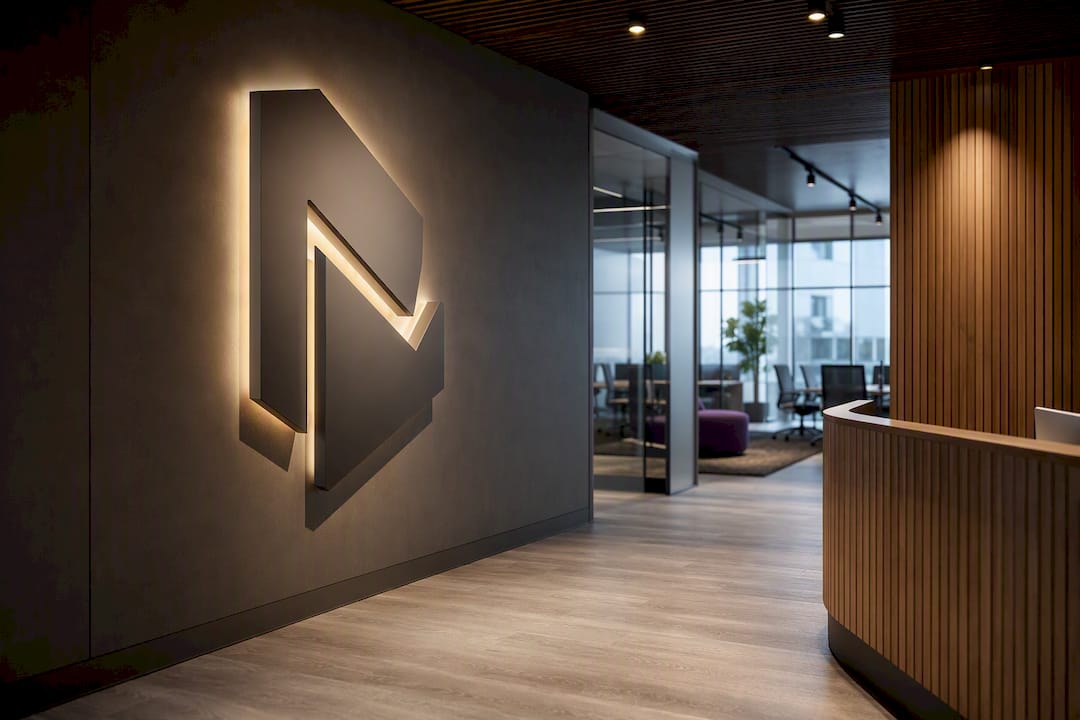
Start with a dimensional reception sign, a hero graphic in your main meeting room and branded glass frosting on internal partitions. These three moves cost a fraction of a full fit-out, and together they’re the fastest way to make a workspace look and feel like your brand. A consistent material palette across those touchpoints does the rest, and a specialist can scope the whole thing in a single visit if you’d rather not manage it yourself.
TL;DR:
- Prioritize reception signage, hero wall graphics, and branded materials as the most cost-effective ways to create a strong visual impact quickly.
- Focus on high-visibility zones such as reception, main corridors, and key meeting rooms first to maximize branding effectiveness within limited budgets.
- Use removable and non-invasive branding solutions like vinyl decals and freestanding signage for leased spaces to avoid lease violations and enable easy updates.
- Incorporate materials like metal, acrylic, and fabric thoughtfully, balancing cost, durability, and visual appeal to convey your brand mood.
- Combine physical signage with digital displays for flexibility and real-time updates, extending branding impact without significant structural changes.
Table of Contents
- Quick shortlist: 10 high-impact office branding ideas
- High-impact priorities by budget: what to do first on a small, medium or large budget
- Area-by-area ideas: reception, meeting rooms, breakouts, corridors and workstations
- Renter-friendly and low-cost approaches that avoid fit-out work
- Materials, finishes and acoustic considerations that express brand mood
- Implementation checklist: from brief to install and simple prioritisation plan
- When to hire a specialist and what to expect: Niche Projects’ role and proof points
- Measuring and evaluating the impact of branding elements to optimise effectiveness
- Integrating brand values and company culture into the physical office design
- Examples of successful office branding transformations for inspiration
- Digital and interactive branding to complement physical branding
- Ready to put a plan in place?
- Sources
- FAQ
Quick shortlist: 10 high-impact office branding ideas
Reception signage and a meeting-room hero graphic remain the two highest-return investments when funds are tight, according to Evoke Studio’s office branding guide. Beyond those, here’s what actually moves the needle:
- 3D logo signage for reception; brushed metal or acrylic letters read as premium and last years.
- Large-format wall wrap in a boardroom or corridor, one of the most effective, affordable environmental branding tools according to Lucent Graphics Solutions.
- Branded glass frosting on partitions for privacy and identity in one hit.
- A mission or values wall near the main walkway, printed rather than painted for easy updates.
- Curated local artwork in breakout zones, cheap to rotate, renter-friendly if leased.
- Wayfinding signage using brand colours and typefaces, not generic arrows.
- Acoustic panels printed with brand graphics, functional and visual at once.
- Feature lighting over reception or the boardroom table.
- Branded furniture accents, cushions, rugs, or upholstery in brand colours.
- On-brand collateral: coasters, notepads, and signage templates for client-facing rooms.
High-impact priorities by budget: what to do first on a small, medium or large budget
Reception signage, a meeting-room hero graphic and branded materials deliver the most visible change per dollar spent, which is why Evoke Studio lists them as the starting point for budget-constrained projects. Where you go next depends on how much you’ve got to spend.
- Entry-level (small budget): reception sign, one hero wall in the main meeting room, branded stationery and signage templates. Expect two to four weeks from brief to install.
- Mid-range: add frosted or printed glass film, acrylic or metal dimensional lettering, and acoustic panels in meeting rooms. Budget six to ten weeks, longer if custom printing is involved.
- Large projects: full wall wraps across corridors, integrated joinery that carries brand materials, lighting upgrades, and a curated art programme. This runs three to six months when it touches multiple floors or requires trade coordination.
Pro Tip: Don’t spread a small budget across ten touchpoints. Nail reception and one meeting room properly first, then expand once you can see how staff and clients respond.
Area-by-area ideas: reception, meeting rooms, breakouts, corridors and workstations
Every zone in an office does a different job, so the branding in each should behave differently too.
Reception carries the most weight for first impressions. A dimensional logo, backlit if the budget allows, paired with clear sightlines to the rest of the space, sets the tone before anyone speaks to your team.
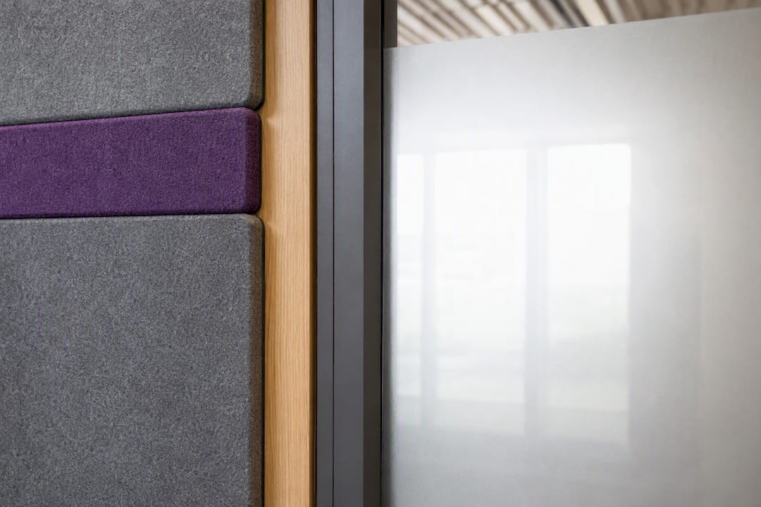
Meeting rooms benefit from a hero wall graphic or values statement, ideally in brand colours, plus acoustic panels that double as decoration. Frosted glass on the corridor-facing wall adds privacy without losing light.
Breakout and pantry areas are where culture shows up. A branded café-style fit, a recognition wall for team wins, and flexible seating make these spaces feel lived-in rather than corporate leftovers.
Corridors and wayfinding are underused real estate. Storytelling murals, floor decals, and thematic room names (rather than “Meeting Room 3”) turn functional circulation into brand moments, echoing the systems-thinking approach in VisibilitySign’s office branding guide.
Workstations need a lighter touch: subtle material accents, a personalisation zone for desks, and quiet pods finished in brand materials rather than generic grey.
Renter-friendly and low-cost approaches that avoid fit-out work
Leased offices don’t need to miss out. Removable vinyl decals, non-adhesive window clings, and temporary floor graphics let you make a visible change without breaching your lease, a point Lucent Graphics Solutions makes when discussing low-commitment branding systems.
- Fabric frames and printed canvases hang like art and come down without a mark.
- Magnetic or freestanding signage works in reception without touching walls.
- Swap artwork, rugs, and cushions for branded alternatives, low cost, high visual return.
- Branded crockery and printed collateral extend the identity into everyday use.
Check your lease for make-good clauses before anything goes up, and avoid strong adhesives on painted or heritage surfaces.
Pro Tip: If you’re not sure a design will land, ask a designer to mock up one wall digitally before committing. It’s far cheaper than repainting.
Materials, finishes and acoustic considerations that express brand mood
Materials say as much about your brand as your logo does. Timber reads as warm and approachable, metal signals premium and considered, stone or porcelain suggests permanence, and fabric softens a space that might otherwise feel clinical.
- Acrylic signage is affordable and versatile but scratches over time in high-traffic areas.
- Metal dimensional letters cost more upfront but hold their finish for years.
- Backlit signage adds impact in reception but needs power planning during install.
- Printed vinyl is the cheapest option and the easiest to replace when a brand refreshes.
Acoustic panels deserve more credit than they usually get. Beyond controlling noise, printed acoustic surfaces in brand colours turn a functional necessity into a visual asset, particularly in open meeting rooms where hard surfaces otherwise bounce sound around. In high-traffic zones, choose finishes that wipe clean and resist scuffing. A hallway wrap that looks tired within a year defeats the purpose.
Implementation checklist: from brief to install and simple prioritisation plan
Getting from idea to installed branding follows a fairly predictable sequence, and skipping steps is usually what causes delays or rework.
- Define your brand rules first: logo files, Pantone or paint equivalents, typography, and any existing style guide.
- Audit your surfaces: walk the office and note every wall, window, and signage opportunity.
- Choose one to three priority moves rather than trying to brand everything at once.
- Request quotes and mock-ups from suppliers so you can compare before committing.
- Get approvals sorted, including landlord sign-off where relevant, before ordering materials.
- Schedule install around working hours or after-hours access, then handover with maintenance notes.
Your brief should include brand assets, exact dimensions, preferred materials, and any supplier you already trust. Before signing off on anything permanent, check egress requirements, fire signage compliance, building approvals, and accessibility standards, these get missed more often than you’d think.
Timelines vary by scope: small projects run two to four weeks, mid-range work six to ten weeks, and large multi-floor projects three to six months.
Pro Tip: Get your brand assets into one folder before you brief anyone. Half of all project delays come from chasing down the right logo file or Pantone code mid-install.
When to hire a specialist and what to expect: Niche Projects’ role and proof points
A specialist earns its fee when a project touches acoustics, custom joinery, or a heritage building, areas where a wrong material choice is expensive to undo. Specialists can work with executives and office managers to deliver fit-for-purpose spaces that combine design creativity with construction know-how, reducing the back-and-forth between designer and builder.
Before commissioning anyone, ask for case studies and photos of completed projects, realistic timelines, and client references you can actually call. A short diagnostic conversation or space plan upfront tells you whether your budget matches your ambitions before any construction starts.
Measuring and evaluating the impact of branding elements to optimise effectiveness
Branding spend is easy to justify with a story and hard to justify with numbers, so it’s worth building in a few simple checks before you commit budget to phase two.
Start with observation. Do visitors comment on reception when they arrive? Do staff use the branded breakout space more than the old one? These informal signals matter more than they sound, because they tell you whether the design is actually being noticed and used, not just admired in photos.
Staff surveys work well here. A short pulse survey before and after a branding change, asking about pride in the workspace, ease of navigation, and comfort in meeting rooms, gives you a baseline to compare against. Track recruitment feedback too. Candidates often mention office impressions during interview debriefs, and that’s a direct line between branding spend and hiring outcomes.
For client-facing spaces, ask your sales or account teams whether prospects comment on the office. A branded reception and boardroom that consistently gets remarked on is doing its job, even without a formal metric attached.
If you’re rolling out branding in stages, treat the first phase as a test. Install the reception sign and one meeting-room graphic, watch how people respond over four to six weeks, then decide whether the next phase needs adjusting. This staged approach also protects you from spending a large budget on a direction that doesn’t land the way you expected.
Integrating brand values and company culture into the physical office design
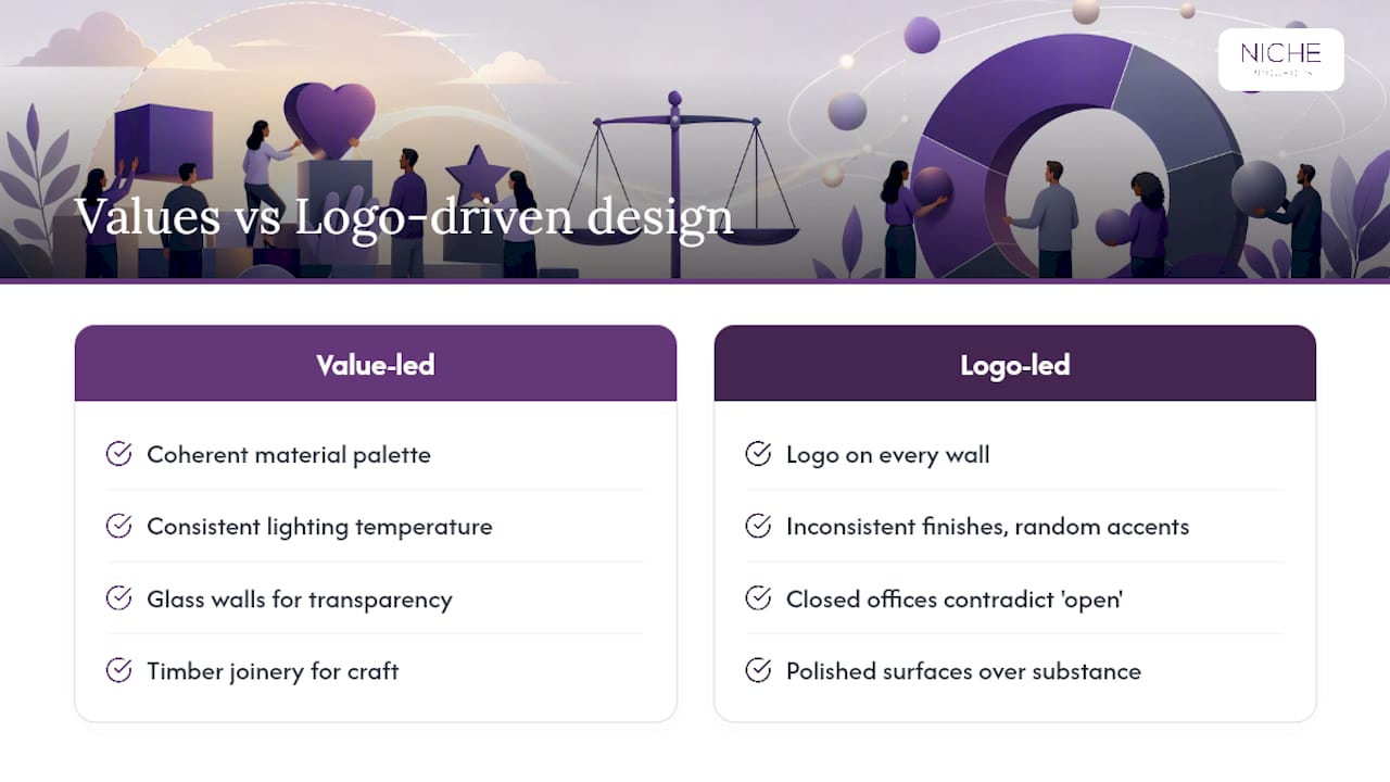
Design choices should be purpose-driven rather than logo-driven. Repeating your logo across every wall reads as insecure, not confident. A coherent material palette, consistent lighting temperature, and a considered colour story communicate brand identity more durably than a dozen logo placements ever will.
Start with what your company actually values, then translate that into physical choices. A firm that prizes transparency might use glass walls and open sightlines instead of closed offices. A business built on craft might invest in visible timber joinery rather than polished surfaces. These decisions carry more weight than a mission statement painted on a wall, because they’re structural rather than decorative.
Culture also shows up in the informal spaces. A recognition wall celebrating team wins, a café-style breakout that encourages people to linger, or a quiet room that acknowledges not everyone thrives in open-plan noise, all of these say something about how a company treats its people. Grounding the story in local context or the building’s own history gives staff something to identify with beyond the brand colours, and that kind of place-making tends to support retention in ways a fresh coat of paint alone won’t.
The mistake to avoid is treating culture as a mood board exercise disconnected from how people actually work. If your values say “collaborative” but every desk is boxed into a private pod, the physical space contradicts the message on the wall.
Examples of successful office branding transformations for inspiration
Intuit’s workplace redesign in San Francisco shows what’s possible without a ground-up rebuild. The project leaned on local storytelling and curated artwork to transform circulation areas and meeting spaces, while retaining much of the existing architecture, proof that a full demolition isn’t required to deliver a strong brand feel.
A separate office interior project reinforces the same lesson: prioritising the building’s existing bones and making a few thoughtful visual interventions reduces waste and construction time while still achieving a cohesive branded result. Rather than stripping a space back to bare concrete, these approaches work with what’s already there, existing ceiling heights, structural columns, natural light, and use signage, colour and material choices to layer brand identity on top.
The common thread across both examples is restraint. Neither project tried to brand every square metre. Instead, they picked the spaces with the most foot traffic and visual impact, reception, main corridors, and key meeting rooms, and concentrated effort there. That’s the same logic behind starting small on a limited budget: pick your highest-visibility zones first, and let the rest of the space carry a lighter, more consistent material and colour language.
Digital and interactive branding to complement physical branding
Physical branding sets the tone, but digital signage and interactive displays extend it in ways static signage can’t. A digital screen in reception can rotate between welcome messages, client logos, and live updates, giving you flexibility a printed sign never will.
Interactive displays in breakout areas or corridors can showcase project work, team achievements, or company news, turning a static wall into something staff actually stop and look at. For client-facing spaces, a touchscreen directory or wayfinding display reinforces brand polish while solving a genuinely useful navigation problem.
The advantage over printed signage is agility. A brand refresh, a change in messaging, or a new campaign updates in minutes rather than requiring a reprint and reinstall. The trade-off is upfront cost and the need for ongoing content management, someone has to keep the screens fresh, or they become dead weight fast.
For most offices, digital signage works best as a complement to physical branding rather than a replacement. A dimensional reception sign gives permanence and craft; a digital screen beside it gives flexibility and freshness. Used together, they cover both bases without asking either element to do a job it’s not suited to.
Ready to put a plan in place?
If you’d rather not manage suppliers, quotes, and installation timelines yourself, Nicheprojects offers a free office space plan that maps out exactly where your budget will have the most visible impact, before you commit to anything. It suits business owners and office managers who know they want a branded workspace but aren’t sure whether to start with reception, meeting rooms, or a full refresh.
Some providers work across strategy, design, and construction management, which means one team handles the brief through to handover instead of you coordinating a designer, a signage supplier, and a builder separately. For workplaces where productivity and staff wellbeing are part of the brief, the cultivating productivity through office design service page outlines how branded design choices tie into performance outcomes, not just appearance.
Book a space plan conversation to find out what’s achievable within your current lease and budget, before you spend a dollar on materials.
Sources
- Office Branding Guide: Design a workspace that reinforces your brand (Evoke Studio)
- Office branding ideas that give your workspace a real identity (Lucent Graphics Solutions)
- Complete office branding guide: from reception signs to washroom icons & window graphics (VisibilitySign)
- Inside Intuit’s next‑gen workplace in San Francisco (Interior Design)
FAQ
What are some good office branding ideas?
Dimensional reception signage, a hero wall graphic in your main meeting room, branded glass frosting, and a consistent material palette across the space deliver the most visible impact for the lowest investment.
What are the key office design trends for 2026?
Acoustic branding, place-making rooted in local storytelling, and digital signage that complements rather than replaces physical branding are shaping how workplaces get designed this year.
How do I spice up my office without a full renovation?
Removable vinyl decals, fabric-framed artwork, branded cushions and rugs, and a printed wall graphic in one key room can transform the feel of a space without touching the lease or structure.
What are some creative ideas for office interior design?
Themed wayfinding with room names tied to your brand story, printed acoustic panels that double as art, and curated local artwork in breakout areas all add character beyond standard signage.
When should I bring in a specialist instead of doing it myself?
Once a project involves acoustics, custom joinery, heritage building constraints, or coordination across multiple trades, a specialist like Nicheprojects typically reduces cost and disruption compared with managing separate suppliers yourself.