
Colour does influence how people feel at work, but not in the tidy “blue for focus, red for energy” way most guides suggest. The research shows real, measurable links between colour, mood and performance, and it also shows that the effect depends on the person, the task and the light. The best office colour schemes use a calm neutral base, add colour where people will notice it, and are tested under your actual lighting before anyone picks up a roller.
TL;DR
- A review of 40 workplace studies found significant links between colour and mood, wellbeing and work outcomes, but no single colour wins for everyone.
- Blue, green and white tend to feel calm, red, yellow and orange tend to feel energising, and grey tends to feel flat. Treat these as starting points, not rules.
- Use neutrals across large work areas and keep stronger colour for reception, collaboration zones and feature walls.
- Lighting, finishes and contrast change how a colour looks and how accessible a space is, so test samples in place.
- Never rely on colour alone for signage or meaning, because some colleagues cannot tell certain colours apart.
Table of Contents
- What the research says about colour at work
- Colour by colour: what the evidence supports
- Build a neutral base, then add colour where it’s noticed
- Colour schemes for different areas of the office
- Light and finishes change every colour
- Colour, inclusion and accessibility
- Making your brand colours work without overwhelming the room
- How to test and roll out a colour scheme
- Getting colour right in a Sydney office
- FAQ
- Sources
What the research says about colour at work
The broadest evidence comes from a 2018 systematic review of 40 papers on colour in work environments. It reported significant relationships between colour and affect, wellbeing (including stress and comfort) and work outcomes such as productivity, performance and creativity. So colour matters. The harder question is how much, and for whom.
A 2007 study of white, red and blue-green offices found that the effect on productivity depended on each person’s stimulus-screening ability and on how long they were exposed, rather than producing one universal winner. People who filter out stimulation easily cope with busy, saturated rooms. People who don’t can find the same room draining by Thursday.
The lesson is practical. A colour scheme is not a switch that raises productivity. It is one of several conditions, alongside light, noise, layout and ergonomics, that make a space easier or harder to work in. We cover that wider picture in our piece on the psychology behind good office design.
Why “blue creates trust” is a hypothesis
Colour effects depend on hue, lightness, saturation, context, task, audience and culture. One research guide advises treating claims like “blue creates trust” as hypotheses rather than universal rules. A navy feature wall in a law firm reads very differently from the same blue in a children’s clinic. Define who uses the space, what they do there and what you want to improve, then pick colour to serve that.
Colour by colour: what the evidence supports
A 2025 systematic review covering 132 articles, 42,266 participants and 64 countries found that colour and emotion are linked systematically, but the links are usually many-to-many and shift with lightness, saturation and hue. A pale, soft blue and a deep, saturated blue are not the same experience. The same review gives a useful map of the general tendencies.
| Colour | Typical association | How it tends to work in an office |
|---|---|---|
| Blue | Positive, low arousal (calm) | Quiet zones, focus rooms, meeting rooms |
| Green and blue-green | Positive, low arousal | Wellbeing areas, breakout spaces, open-plan backdrops |
| White | Positive, low arousal | Clean base, but can feel sterile if used everywhere |
| Red | High arousal, positive and negative | Small accents only, such as a joinery detail or signage |
| Yellow and orange | Positive, high arousal | Collaboration areas, kitchens, informal zones |
| Purple | Some empowering feelings | Accent for creative or premium touches |
| Grey | Negative, low arousal | Use with care, warm it up with timber or texture |
| Light colours overall | More positive emotions | Helpful in areas with limited daylight |
| Dark colours overall | More negative emotions | Better as a deliberate, small-scale contrast |
Two older experiments add useful nuance. In a 1996 study with 675 participants, people made significantly more proofreading errors in a white office than in blue and red ones. Participants were least likely to choose orange or purple offices and most likely to prefer beige or white. That is a good reminder that what people say they like and what helps them perform are not always the same thing.
It also explains why “all white” is a weak default. It tests well for preference and poorly for detail-heavy work when nothing breaks it up.
Build a neutral base, then add colour where it’s noticed
The most consistent advice from workplace designers is selective. Australia’s PS News reports that colour should support the organisation’s mission and culture, with neutrals across large work areas and stronger colour reserved for places people will notice, such as reception. The same article’s experts also suggest balancing colour with materials such as wood, stone or metal.
In practice that gives you three layers:
- Base. Warm whites, soft greys, stone and timber tones across ceilings, most walls and flooring. This is the part you live with for years.
- Support. Muted blues and greens in focus areas, meeting rooms and wellbeing spaces.
- Accent. Saturated colour in small doses: reception, a kitchen feature wall, a collaboration hub, joinery, soft furnishings.
Accents are also the cheap layer to change. When a team grows or a rebrand lands, you can repaint one wall or swap upholstery without touching the base. Our guide to picking the right office colour scheme goes deeper on choosing each layer.
Colour schemes for different areas of the office
One palette across every zone is a missed opportunity. Resene’s colour guidance for interior designers recommends a mix of moderately colourful spaces and blank-canvas spaces with window views for visual respite, while keeping visual clutter and distractions low. In other words, vary the temperature of the floor plan.
Focus and quiet areas
Choose lower-saturation blues, greens and soft neutrals. The aim is a visually quiet room: few competing patterns, limited strong contrast in the line of sight, and surfaces that don’t glare. Window views help here more than any paint colour does.
Collaboration and social spaces
Warmer, brighter colours suit places where energy is the point: project rooms, kitchens, informal lounges. Keep the volume under control by limiting the saturated colour to one or two surfaces and letting timber or soft furnishings carry the rest.
Reception and client-facing areas
This is where brand colour earns its place. Visitors form an impression in seconds, and a confident accent wall or signage in your brand colour does more here than it would in an open-plan work zone. See our article on refurbishing your office reception area for how we approach it.
Wayfinding between zones
Colour can also help people navigate. PS News notes that colour can differentiate work settings, for instance separating quiet focus areas from collaborative ones. In a larger floor plate, a consistent colour for each type of space tells people what behaviour to expect before they read a sign.
Light and finishes change every colour
A paint chip under a showroom light is not your office. Colour shifts with daylight through the day, with the colour temperature of your fittings, and with the reflectivity of surrounding surfaces.
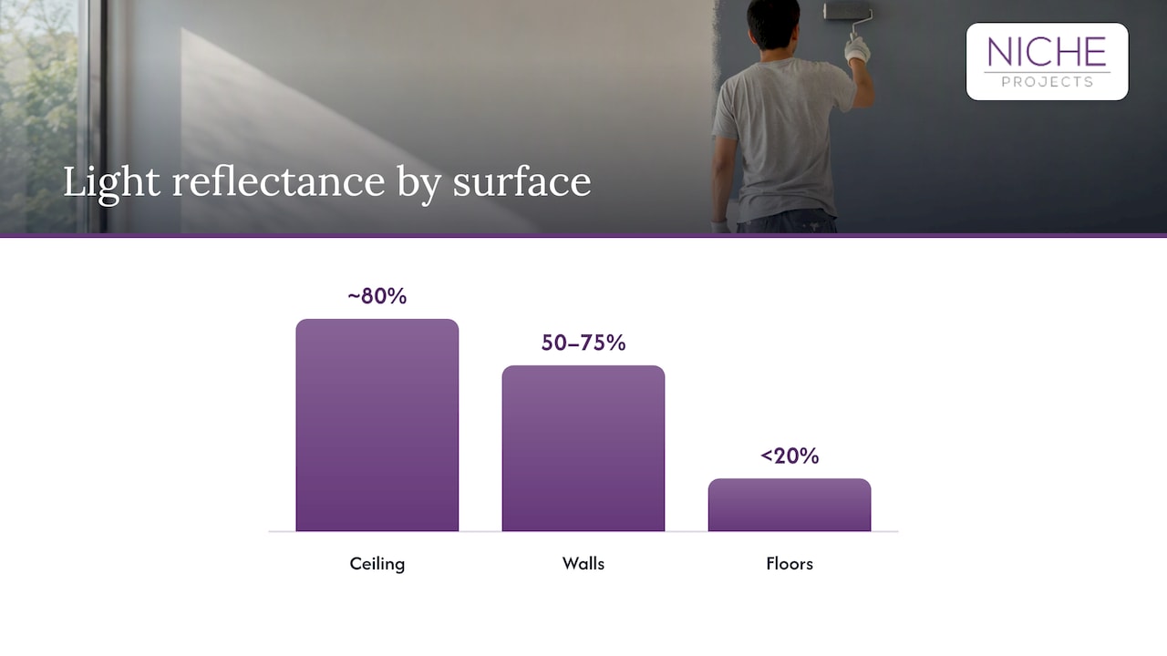
WorkSafe Victoria’s office design guidance says lighting decisions should consider the task, hazards, natural and artificial light, contrast and reflections, and how colours appear under the lights. It also recommends ceilings reflecting about 80% of light, walls reflecting 50 to 75% in subdued cool colours with gloss or semi-gloss finishes, and darker floors with reflectivity below 20%. Those figures are a useful brief for your designer, since a dark, matte wall in a dim corner will swallow light that your fittings then have to make up for.
Safe Work Australia’s December 2025 Model Code on managing the work environment and facilities adds that lighting must support safe movement and work without awkward postures or eye strain, taking account of glare, contrast and reflections. Colour and lighting are one decision, not two. If you are planning both, read our notes on office lighting design and the role of lighting in workplace safety.
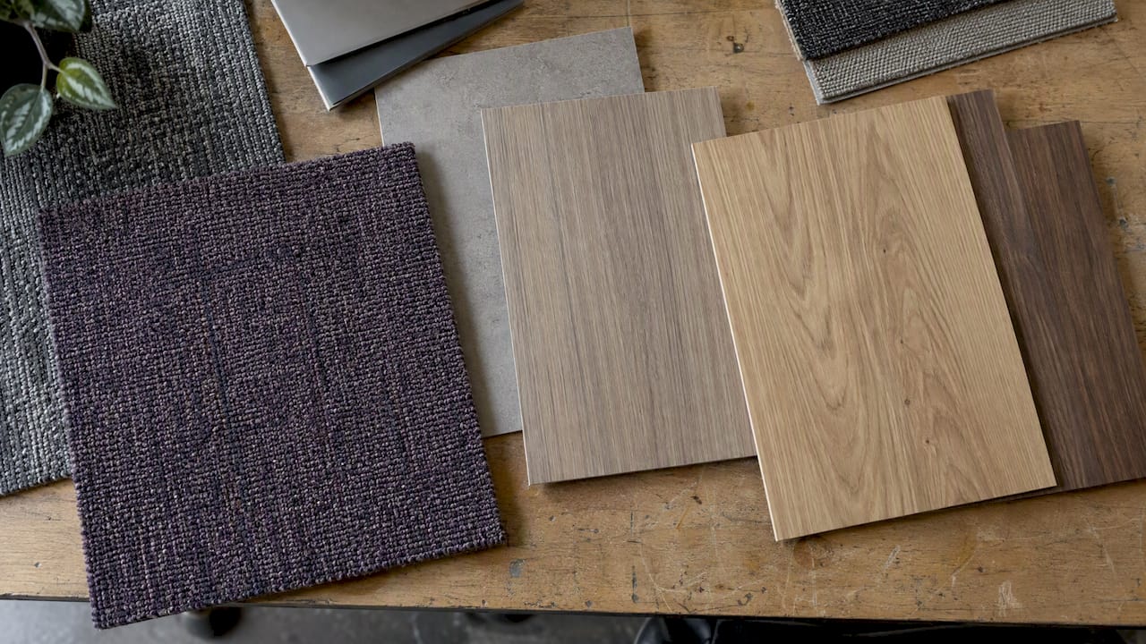
Small details matter too. Carpet tile, laminate, joinery and existing ceilings all have undertones. A grey that looks neutral on its own can turn green next to a yellow-toned timber veneer. Lay your real finishes side by side before you commit.
Colour, inclusion and accessibility
A good palette works for people who see colour differently, and for people who are sensitive to sensory load.
The Australian Department of Finance’s 2025 inclusive-design guidance identifies lighting, noise and office navigation as the three most common physical-environment barriers for neurodivergent employees in its sample of Australian Public Service tenancies. It recommends adequate lighting and luminance contrast, consistent signage colours, symbols and shapes, and lighting that can be adjusted or zoned. Colour touches all three barriers.
A few rules follow:
- Don’t use colour as the only signal. The Australian Government’s Agriculture Design System says colour should not be the only means of conveying meaning, and that extra visual cues help colour-blind users. On a floor plan, pair colour-coded zones with icons or text.
- Check contrast on signage and wayfinding. The Victorian Government’s accessible-colour guidance sets WCAG 2.2 AA minimums of 4.5:1 for normal text and 3:1 for large text. That standard is written for digital content, but it is a sound benchmark for printed signage and door numbers too.
- Give people choice. Include a few low-stimulation, blank-canvas spaces and lighting that can be dimmed or zoned. One palette will never suit every nervous system.
For the wellbeing angle, see our article on office design and mental health.
Making your brand colours work without overwhelming the room
Brand colour belongs in the office, but not on every wall. Large saturated surfaces in your logo colour can make a workplace feel like a billboard. A better approach is to translate the palette: use the brand colour at full strength in reception and signage, and pull softer tints or complementary tones into work areas.
One large Australian bank’s design system puts the principle well: it maps brand palettes to contextual colours with defined purposes and tests colour combinations for accessibility. You can borrow the thinking. Decide what each colour is for (identify a space, mark a zone, signal a hazard, welcome a visitor) and use it only for that.
The same logic applies to people. If you want a consistent look across team photography, a plain, controlled backdrop that matches your palette keeps headshots tidy. This guide to consistent team headshot backgrounds shows how neutral surfaces keep portraits uniform.
How to test and roll out a colour scheme
Colour claims are strongest when you tie them to a defined audience, task and measurable outcome. A simple process keeps the decision grounded:
- Define the problem. Is it a dull reception, a noisy open-plan area, a brand disconnect, or a space nobody uses? Colour solves some of these and not others.
- Map zones and tasks. List what people actually do in each area: detailed screen work, calls, workshops, lunch.
- Set the base and accent rules. Pick the neutral base, one or two supporting hues and a limited accent list.
- Sample in place. Paint large swatches (not small chips) on the actual walls and look at them in morning, midday and evening light, plus under your lighting at night.
- Check contrast and signage. Confirm text and wayfinding meet contrast targets, and that no meaning depends on colour alone.
- Ask the people who use the space. A short survey before and after a refresh, covering comfort, focus and how easy the office is to navigate, tells you more than a rule of thumb.
- Stage the work. Painting is one of the quickest ways to refresh, but it should sit within your wider refurbishment plan. Our pre-design checklist lists what to decide first.
If you are weighing a bigger project, integrating workplace strategy into your office refurbishment explains why colour decisions should follow how your teams actually work.
Getting colour right in a Sydney office
At Niche Projects, we treat colour as part of workplace strategy, not a finishing touch. We combine design and construction under one roof, so the palette you approve on a mood board is the one that lands on the walls, with lighting, joinery and finishes coordinated around it. If you are planning a refresh, start with our Sydney office design service, or talk to us about an office fitout or refurbishment across Sydney.
FAQ
What is the best colour for an office?
There is no single best colour. Research links blue, green and white with calm, and yellow and orange with energy, but effects vary by person, task and lighting. A neutral base with colour added in chosen areas is the safest and most flexible approach.
Does colour really affect productivity?
It can. A review of 40 studies found significant links between colour and productivity, performance and creativity. The effect is not universal, though: one study found it depended on individual sensitivity and length of exposure, so treat colour as one factor among many.
Should every wall in the office be painted a colour?
No. Neutrals suit large work areas, and stronger colour works best where people notice it, such as reception or a collaboration zone. Blank-canvas spaces also give people visual rest.
How do I make an office colour scheme accessible?
Avoid using colour as the only way to convey meaning, add icons or text to colour-coded zones, and check contrast on signage. Provide adjustable lighting and some low-stimulation areas. Government guidance in Australia highlights lighting, noise and navigation as common barriers.
Do lighting and finishes change how a colour looks?
Yes, significantly. Daylight, fitting colour temperature and surface gloss all alter how a colour reads. Always sample on the real wall and view it at different times of day before committing.
Sources
- The Effects of Colour in Work Environment: A systematic review (2018)
- Work week productivity, visual complexity, and individual differences (2007)
- Do we feel colours? A systematic review of 128 years of research
- Effects of nine monochromatic office interior colors (1996)
- Bright ideas: How colour theory sets the tone for an office, PS News
- Colour in the Built Environment, Resene
- Office health and safety: Designing a healthy and safe working environment, WorkSafe Victoria
- Managing the work environment and facilities, Safe Work Australia (December 2025)
- Property Accessibility Assessment Tool inclusive design considerations, Department of Finance
- Colour tokens, Agriculture Design System
- Typography and accessible colour, Victorian Government
- Colour, GEL Design System
- Color Psychology in Context: Research Guide