
An office wayfinding strategy is a plan for how every person, from a first-day hire to a courier, finds the way from the front door to the right desk, room or exit without asking for help. It decides what things are called, where information appears, which cues do the work (signs, floor finishes, lighting, apps) and how all of it stays accurate as teams and layouts change. The best time to write one is before a fit-out or refurbishment, because the strategy shapes the layout as much as the signs.
This guide walks through what to include, how to plan it, which Australian accessibility requirements apply, and how physical and digital tools fit together.
TL;DR
- A wayfinding strategy covers the whole journey, from arrival and entry through to desks, meeting rooms, amenities and emergency exits, not just the signs on the wall.
- Hybrid work makes it matter more: people who attend one or two days a week cannot rely on a mental map of a space that keeps changing.
- Plan around decision points, a consistent naming hierarchy and four sign types: identification, information, directional and safety.
- Accessibility is designed in from the start, using Australian guidance and standards, not added after signs are installed.
- Test the finished system with real users, on real routes, before and after install.
Table of Contents
- What an office wayfinding strategy actually covers
- Why wayfinding matters more in a hybrid office
- Start with the journeys, not the signs
- Find the decision points and fix the names
- Sign types and where each belongs
- Accessibility and Australian requirements
- How digital tools and physical signage work together
- A step-by-step plan for your workplace
- Build wayfinding into the fit-out
- FAQ
- Sources
What an office wayfinding strategy actually covers
Wayfinding is how people orient themselves in a space and move through it. The Australian Department of Finance describes it in its inclusive design guidance and says effective systems reduce stress and cognitive load, improve visitor experiences and support efficient, safe use of the building.
A useful way to scope it is to follow the day. Property and Development NSW sets out an accessible office design framework built on six stages an employee passes through: arriving and leaving, approaching and entering, moving through buildings, using work areas, using amenities, and using communications systems such as booking, destination control, signage and sign-in. Each stage is a place where a person can get stuck.
In practice, a complete strategy includes:
- Arrival and entry: how people find the right entrance, lift lobby and reception.
- Zones and destinations: desk neighbourhoods, meeting rooms, focus rooms, collaboration areas, quiet zones and shared amenities.
- Naming and numbering: one consistent system for floors, rooms and desks.
- Sign system: types, hierarchy, placement, materials and the accessibility specification.
- Digital layer: maps, booking links, check-in and visitor instructions, where the business uses them.
- Safety and exceptions: exits, assembly areas, deliveries and temporary closures.
A workplace wayfinding guide from Tactic lists very similar elements, including instructions for visitors, deliveries, emergencies and temporary closures. These are the situations most offices forget until the first time they happen.
Why wayfinding matters more in a hybrid office
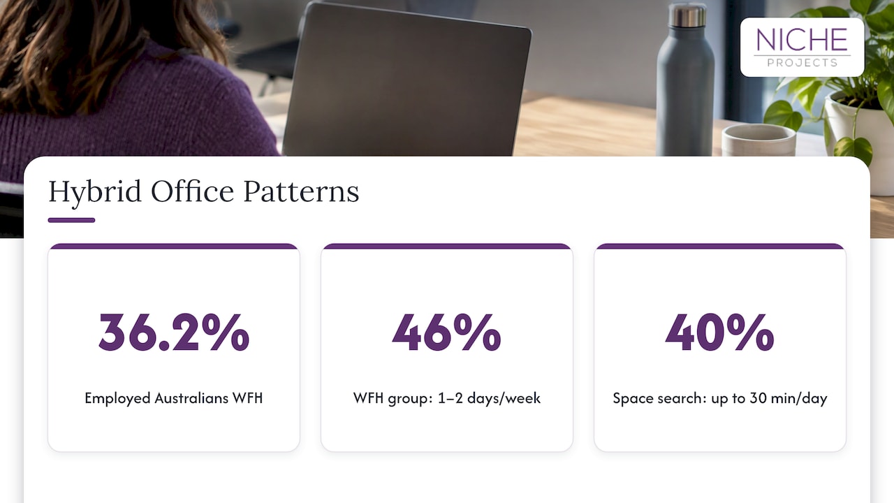
In a fixed-desk office, people learn the layout in a week. In a hybrid one, they do not. ABS data summarised by Rider Levett Bucknall shows that in August 2025 36.2% of employed Australians worked from home, and that 46% of those did so one to two days a week. Hybrid is routine, which means a large share of your staff are occasional users of the space.
Occasional users are the people who most need clear cues. MRI Software notes that employees who come in once or twice a week still need to locate an available desk, find a booked meeting room or meet colleagues across floors. OfficeSpace Software makes a related point: mental maps stop working once desks and teams move every week, and clear, consistent cues help most the people who are least familiar with the layout.
The wasted-time argument is real too. Ricoh Australia cites Microsoft’s 2021 Work Trend Index finding that 40 per cent of workers waste up to 30 minutes a day searching for a space to collaborate. That figure is about collaboration space generally, not wayfinding alone, but it shows why finding the right room is a productivity issue and not only a comfort one.
There is a human side as well. Gregory Gibson of the Centre for Inclusive Design explains that when navigation is intuitive, people feel more comfortable and confident and spend less mental energy on orientation and more on the purpose of their visit. For a visitor walking into a client meeting, that first impression counts.
If you are still shaping how many days people will be in and how space is shared, start with the hybrid workplace strategy decisions. Wayfinding should follow them, not the other way round.
Start with the journeys, not the signs
The most common mistake is to start by choosing sign styles. Start with the journeys people actually make. Tactic identifies six high-value ones to map: first arrival, desk arrival, meeting attendance, team coordination, accessibility (a step-free route and accessible facilities found without asking for help) and emergency response.
For each journey, write down:
- Who is making it (new starter, regular, visitor, contractor, someone using a wheelchair, someone with low vision).
- Where it starts and ends.
- What the person needs to know at each point.
- Where they are most likely to hesitate.
A visitor’s journey is a good example. Archie describes it as four stages: pre-registration, building entry, check-in and destination wayfinding. The email a visitor receives before arrival is part of your wayfinding system, because it should tell them which entrance, which lift bank and which level, in the same words they will later see on the signs.
This is also where the reception area earns its keep. It is the point where digital instructions hand over to physical ones, and the layout should make the next step obvious. Our piece on what makes an office reception design actually work covers that handover.
Find the decision points and fix the names
Once journeys are mapped, mark every decision point: a place where someone must choose a direction. Tactic suggests lobby junctions, lift exits, corridor intersections and security gates, and makes the point that a sign at the destination is less useful than one that prevents a wrong turn. Australian sign consultancy Insigns gives the same advice for complex sites: place information just before the person needs to choose.
Then build a naming hierarchy. Insigns recommends plain language aligned across digital, printed and spoken terms. If the booking system calls a room “Boardroom 2”, the door sign says “Meeting Room 2.04” and the receptionist says “the big room on the left”, people will be confused no matter how good the signs look.
Practical naming rules:
- Number floors, zones and rooms in a pattern someone can predict (level, then zone, then room).
- Avoid themed or cute names that a visitor cannot decode, unless they are always paired with a number.
- Use the same label in the booking tool, on the sign, in the visitor email and in the induction pack.
- Decide who owns the naming list, so a new room is not named ad hoc.
Sign types and where each belongs
The Department of Finance guidance identifies four categories of signage. It quotes PAS 6463:2022, which describes signs as part of an integrated communication scheme, supporting a strategy that accounts for varied user needs and the complexity of the building.
| Sign type | What it does | Typical office example | Placement logic |
|---|---|---|---|
| Identification | Names a place | Room names and numbers, level markers | At the destination, beside the door |
| Information | Gives context | Floor directories, floor plans, amenity lists | At lobbies, lift exits, reception |
| Directional | Points the way | Arrows to zones, toilets, meeting rooms | At decision points |
| Safety and advisory | Protects and instructs | Exits, assembly points, restricted areas | As required for safety and regulation |
The same guidance recommends a consistent mounting height of 1,200 to 1,600 mm, sans-serif fonts, Title Case, international symbols, braille and tactile markings, consistent colours for each sign category, and minimum contrast in line with AS 1428.1 and AS 1319. UNSW’s Wayfinding and Signage Standards are written for a campus, not an office, but they make a point that holds at any scale: consistency across forms, messaging and positioning is critical.
A few design habits that keep a system readable:
- Keep labels short and arrows consistent.
- Separate destinations from supporting information visually.
- Do not rely on colour alone to distinguish zones or routes.
- Keep signs unobstructed from both standing and seated eye levels.
For an office, the physical environment can carry a lot of the load before any sign is read. Distinct zones created by partition choices, floor finishes, ceiling treatments and lighting give people landmarks. A good layout needs fewer signs, and that is worth deciding while the office layout is still on paper.
Accessibility and Australian requirements
Treat accessibility as a design input, not a finishing step. Tactic advises that it should be designed into the navigation system rather than added after signs are installed, and that the experience is reviewed from entrance to destination, including doors, lifts, corridors, toilets, meeting rooms and emergency routes.
What the Australian guidance says
The Australian Human Rights Commission’s guide, Creating an accessible and inclusive workplace, says physical accessibility is multi-layered and includes the accessibility of signage and of waiting and reception areas. It points employers to the Disability (Access to Premises: Buildings) Standards 2010 (Cth) and to Universal Design principles. For signage, it says signs should be:
- large, clear and easy to read;
- marked with recognisable symbols such as the Universal Symbol of Accessibility;
- available in accessible formats including braille;
- positioned where people can find them easily, at a height and position that does not create an obstacle.
The same guide lists seven Universal Design principles: equitable use, flexibility in use, simple and intuitive use, perceptible information, tolerance for error, low physical effort, and size and space for approach and use. It also warns that touch screens used for room bookings and air conditioning can be a barrier for people who are blind or have limited dexterity, and are often mounted at a height that wheelchair users or people of short stature cannot reach. That matters for any digital kiosk in your plan.
The Department of Finance’s universal design fact sheet lists clear and consistent wayfinding and signage throughout the premises, and intuitive layouts that support flow between spaces, as key features of simple and intuitive use.
Braille, tactile signs and the standards
The International Council on English Braille notes that in Australia braille and tactile signs must comply with the Disability (Access to Premises: Buildings) Standards 2010 or, where those do not apply, with the relevant provisions of AS 1428.1-2009. It also says they are required in new or upgraded public buildings to identify key wayfinding points, using uncontracted UEB braille with capitals. Standards are updated over time, so ask your certifier or access consultant which edition and National Construction Code provisions apply to your building class and tenancy before you specify signs.
Note that there is no single “wayfinding standard” for offices in Australia. Requirements come from the building code and access standards for specific sign types, with the rest being design guidance. Your strategy fills that gap with its own rules, written down.
Designing for different users
Think beyond mobility and vision. TalentWeb reports that over 18% of Australian workers say they are or might be neurodivergent, and lists audio-visual cues and step-free access among accessible-workplace considerations. For neurodivergent staff, predictable layouts, consistent naming and low visual clutter are practical wayfinding features. The neuroinclusive design guide for Australian brands is a useful companion when you write sign copy and choose visual styles, and our own pages on neurodiversity and office design and accessibility in the workplace cover the spatial side. For the wider picture, see how to design an accessible and inclusive office.
Tactic also recommends giving step-free route information where routes differ, explaining closures and route changes promptly, offering both digital and human assistance for people who cannot use one channel, and testing instructions with people who have different mobility, vision, hearing, language and cognitive needs.
How digital tools and physical signage work together
Digital wayfinding does not replace signs. Archie describes office wayfinding as a mix of physical systems (mounted signage, printed directories) and digital ones (kiosks, apps, interactive floor plans), which can connect to desk booking, room scheduling, visitor management and occupancy sensors. Mapiq adds that the foundation is an accurate floor-plan model of corridors, rooms, desks, staircases and amenities.
A simple division of labour works well:
- Physical signs handle fixed information: where a room is, where the exits are, which way is the lift. They work for everyone, with no battery or login.
- Digital tools handle changing information: which desk is free, which room is booked, where a colleague is sitting.
- People handle exceptions. A reception team that knows the system is part of it.
Because digital maps depend on the floor plan and naming list, get those right first. If your naming is inconsistent, software will only display the inconsistency on a phone. Where a digital layer is planned, its screens, kiosks and reception points need to be designed into the joinery and power layout during the fit-out, not retrofitted.
Some vendor case studies claim large gains, such as minutes saved per employee per day or reduced real estate footprints. Treat those as vendor figures, and set your own measures instead: a few questions in a staff survey, the number of “where is…?” queries to reception, late starts to meetings.
A step-by-step plan for your workplace
UNSW’s standards set out a 15-step process from audit through to final approval, covering sign locations, selection, content, procurement, artwork and shop-drawing approval, fabrication, installation and defects rectification. An office does not need all 15 steps, but the sequence is a good template.
- Define the users and journeys. Use the six journeys above and add any specific to your business, such as client arrival or deliveries.
- Audit the space. Walk the existing or planned floor plate. Note where people hesitate, where sightlines are blocked and which routes are step-free.
- Map decision points. Mark every junction, lift exit and door that needs a cue.
- Set naming and numbering. Agree one list and apply it everywhere.
- Write the sign schedule. List every sign, its type, location, mounting height, content and accessibility features.
- Design the system. Fix fonts, colours, symbols, materials and contrast, in line with the relevant access standards.
- Approve artwork and shop drawings. Check text and braille against your naming list before anything is fabricated.
- Install and inspect. Check heights, glare and visibility from standing and seated positions.
- Test the whole journey. Insigns recommends testing from arrival to destination and back out again, in the real environment. Ask someone who has never been in the office to find three places with no help.
- Maintain it. Assign an owner. Every new team, room rename or temporary closure should trigger an update to signs, maps and the booking system.
Build wayfinding into the fit-out
Wayfinding is cheapest and most effective when it is decided alongside space planning, joinery and finishes. Retrofitting signs to a confusing floor plan treats the symptom. At Niche Projects, we combine workplace strategy, office design and construction in one team, so how people move through the space can be considered from the first plan through to installation. If you are planning a move or a refresh, our workplace strategy and Sydney office design services are the place to start, and our fit-out and refurbishment work carries the plan through to build. For the strategic framing, read integrating workplace strategy into your office refurbishment.
FAQ
What is the difference between wayfinding and signage?
Signage is one tool within wayfinding. Wayfinding is the whole system of cues that helps people orient themselves and move through a building: layout, landmarks, naming, signs, floor plans and digital tools. A strategy decides what information people need and where, then chooses the signs to deliver it.
Are there Australian standards for office wayfinding signage?
There is no single office wayfinding standard. Braille and tactile signs must follow the Disability (Access to Premises: Buildings) Standards 2010 or, where those do not apply, AS 1428.1-2009, according to the International Council on English Braille. The Department of Finance guidance also refers to AS 1428.1 and AS 1319 for contrast. Confirm current requirements for your building with your certifier.
When should we plan wayfinding for an office project?
During space planning, before the layout and finishes are locked in. Zones, sightlines, landmarks and naming all affect how many signs you need and where they go. Signs are then specified and approved before fabrication, and tested once installed.
Do we need digital wayfinding in a small office?
Not necessarily. A clear layout, consistent naming and well-placed physical signs cover most needs for a single floor. Digital tools become more useful when desks and rooms are shared, teams are hybrid or the space spans several floors or buildings.
How do we know if our wayfinding works?
Run a journey test. Ask people who have never visited, and people with different mobility, vision and cognitive needs, to find several destinations unaided and note where they hesitate. Repeat after changes to the layout or naming.
Sources
- Accessible Office Design, Property and Development NSW
- Property Accessibility Assessment Tool: inclusive design considerations guidance, Department of Finance
- Universal design in the workplace fact sheet, Department of Finance
- Creating an accessible and inclusive workplace, Australian Human Rights Commission
- Braille Signage, International Council on English Braille
- Wayfinding and Signage Standards Revision 12, UNSW Estate Management
- How hybrid work has reshaped Australian offices, RLB
- RICOH Australia Launches RICOH Spaces
- Office Wayfinding: Why Navigation Matters More Than You Think, Centre for Inclusive Design
- The 2026 Facility, TalentWeb
- How to Build a Workplace Wayfinding System, Tactic
- Office wayfinding: A guide for hybrid workplaces, OfficeSpace Software
- What is office wayfinding?, MRI Software
- Office Wayfinding: Types, Benefits, and Best Practices, Archie
- What is Office Wayfinding, Mapiq glossary
- Wayfinding Strategy for Complex Sites, Insigns
- Neuroinclusive Design: A Practical Guide for Australian Brands