
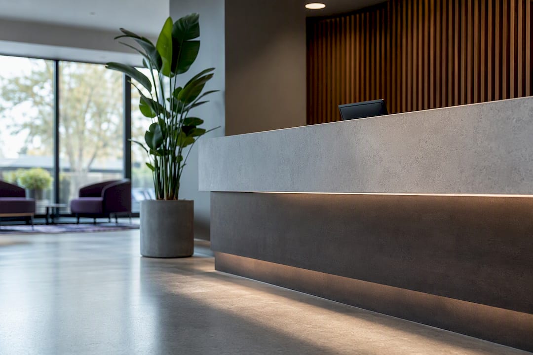
An effective reception balances clear sightlines with a welcoming zone, and it starts with three decisions: set the brand feeling you want visitors to leave with, place the desk where staff can see everyone who walks in, and lock in seating and lighting that hold up to daily traffic. Visitors size up a business within seconds of stepping through the door, and the reception is doing most of that persuading before anyone says a word. Get these three right and everything else, from flooring to furniture, follows naturally.
- Set the brand feeling first (confident, warm, technical) before choosing a single finish.
- Place the reception desk for immediate visibility from the entry.
- Lock in seating and lighting that suit real wait times, not the showroom photo.
Nicheprojects built a pre-design checklist specifically for this stage, so you can brief a designer with facts instead of guesses.
Key Takeaways
Effective office reception design succeeds when desk placement, zoning, lighting and material choices are all set by real visitor behaviour rather than aesthetic preference alone.
| Point | Details |
|---|---|
| Desk visibility comes first | Position the reception desk so staff see the entry and key corridors immediately. |
| Zone without walls | Use flooring, ceiling and lighting changes to separate public and restricted areas. |
| Match seating to wait time | Choose formal chairs for short visits and softer sofas where waits run long. |
| Plan maintenance before finishes | Confirm who manages weekly upkeep before committing to delicate materials. |
| Start with a pre-design checklist | Nicheprojects’ checklist captures visitor numbers, security needs and budget before you brief a designer. |
Table of Contents
- Quick office reception design checklist before you start
- How should you plan reception zoning and sightlines?
- Which materials best translate brand into reception design
- What seating and accessibility setup suits your visitors?
- How do lighting and acoustics improve reception quality
- How do you balance a welcoming feel with security?
- Maintenance and the pre-design checklist that saves you rework
- How does colour affect what visitors think of your business?
- What role do plants and natural materials play in reception design?
- Designing reception for corporate, medical and hospitality settings
- Sustainable choices that hold up in a reception fit out
- Getting your reception fit out off the ground with Nicheprojects
- Sources
Quick office reception design checklist before you start
Before anyone picks a paint colour or orders a sofa, work through the decisions that actually shape the brief. Skipping this step is why so many reception fit outs look good on day one and feel wrong within six months.
- Map the visitor journey and decide what people should feel walking in, whether that’s calm confidence for a law firm or energetic momentum for a tech startup.
- Confirm your functional zones, average daily visitor numbers, and any security or access restrictions the design needs to work around.
- Assess your maintenance capacity honestly, then set a budget band and timeline that matches it.
- Decide which technology you actually need, such as digital check-in, wayfinding screens or charging points, and note any accessibility or building code requirements.
Pro Tip: Count your actual weekly visitor traffic for two weeks before briefing anyone. Most offices overestimate volume and end up with more seating and desk space than they’ll ever use.
Startups and established corporates rarely need the same brief. A firm with client meetings every hour needs a different waiting capacity to a business that sees three visitors a week, and Nicheprojects’ approach for startup fit outs reflects exactly that difference in scale and expectation.
How should you plan reception zoning and sightlines?
The desk needs to be the first thing a visitor’s eye lands on. Not the art, not the plants, the desk. If someone walks in and has to hunt for the person meant to greet them, the whole arrival sequence falls apart before it starts. Placing the desk within direct sightline of the main entry, and positioning it so staff can see the front door and any internal corridors at the same time, solves most of the friction people feel in badly designed lobbies.
You don’t need walls to create zones. A change in flooring, a drop in ceiling height, or a shift in lighting tone does the job without making the space feel divided or institutional. Guidance from commercial interior specialists backs this up: a clear spatial sequence from entry to seating to service reduces visitor confusion more reliably than signage does.
A few dimension rules worth locking in early:
- Allow roughly 1.5 square metres per seated person in the waiting zone, more if wheelchair access is required.
- Keep circulation paths between 900 and 1,200 millimetres wide as a minimum clear width.
- Give the space one clear focal point, whether that’s the desk, a feature wall or a piece of signage, so visitors don’t need to think about where to look.
Nicheprojects’ guide to office layouts and circulation goes deeper on how sightlines change depending on your floor plate and entry configuration.
Which materials best translate brand into reception design
The wall behind the reception desk carries more brand weight than any other surface in the building, because it’s the one thing every visitor photographs, remembers, or mentions on the way out. Timber veneer signals warmth and permanence. Textured wallcoverings or subtle backlit panels signal something more contemporary. Whichever direction you go, that wall should say more about your business than your logo alone ever could.
Flooring choices matter just as much, and they should change by zone rather than run uniform across the whole space:
- Durable hard finishes such as porcelain tile or polished concrete in circulation areas, where daily foot traffic and delivery trolleys do the most damage.
- Carpet tile or luxury vinyl tile (LVT) in waiting zones, where softer flooring absorbs sound and feels more comfortable underfoot.
- Natural stone or premium timber reserved for feature moments rather than full coverage, since cost and maintenance climb quickly at scale.
Prioritise low-VOC coatings, stain-resistant upholstery fabrics, and finishes your existing cleaning team can actually service without specialist products. A gorgeous material that needs a fortnightly professional treatment becomes a liability within a year. Nicheprojects’ guide to designing for brand identity covers how to pick finishes that hold their story over time, not just on installation day.
What seating and accessibility setup suits your visitors?
Match seating to how long people actually wait, not how the space looks in a render. A reception where most visitors are through in under five minutes needs upright, formal lounge chairs that encourage people to sit briefly and stay alert. A space where wait times regularly stretch past fifteen minutes needs softer sofas, side tables, and somewhere to put a laptop bag down.
- Provide a mix of seating types so groups and solo visitors both have a comfortable option with a clear line of sight to the desk.
- Reserve accessible seating with adequate clearance, and include a lowered section of desk at wheelchair height, which many receptions still overlook.
- Choose commercial-grade, cleanable upholstery over anything delicate. Reception furniture takes more daily wear than almost anything else in the building.
Pro Tip: Leave at least one power outlet accessible from the seating area. Visitors waiting more than ten minutes will almost always reach for a phone charger, and a hidden outlet behind furniture defeats the purpose.
For a deeper look at how accessibility and ergonomics intersect in shared spaces, Nicheprojects’ ergonomic design service page is worth reviewing before you finalise furniture orders.
How do lighting and acoustics improve reception quality
Layered lighting, meaning ambient, task and accent light working together rather than a single overhead fixture, changes how polished a reception feels more than almost any other single decision. Aim for warm colour temperatures in the range commonly recommended for reception areas. Cooler light reads clinical, and in a reception that’s rarely the impression you’re after unless you’re running a medical or lab facility where clean and clinical is the point.
Acoustic control matters just as much as lighting, and it’s the detail most briefs miss entirely. Hard, reflective surfaces bounce sound and make even a quiet reception feel noisy and unsettled. Acoustic ceiling panels, fabric-wrapped wall panels, and carpet tile in the waiting zone all cut reverberation without changing the aesthetic much.
- Layer ambient, task and accent lighting rather than relying on one ceiling-mounted fixture.
- Reduce hard reflective surfaces in waiting areas specifically, since that’s where people sit still long enough to notice noise.
- Integrate discreet technology such as visitor kiosks, digital directory screens and hidden charging points, keeping the desk surface itself clear of clutter.
Nicheprojects’ lighting selection guide breaks down fixture types and placement in more detail if you’re briefing an electrician alongside your designer.
How do you balance a welcoming feel with security?
The tension every reception design has to resolve is welcome versus control, and the best solutions handle it through geometry rather than barriers. A curved or angled desk gives staff a wider field of view across the entry and any adjoining corridors than a straight desk against a wall ever will.
- Use floor material changes, ceiling treatment shifts or lighting drops to separate public and restricted zones, rather than glass partitions or high counters that feel like a bank teller window.
- Position the desk so staff maintain sightlines to the main entry and any secondary access points at all times.
- Plan sign-in flow, whether digital or paper, so staff can process a visitor without breaking eye contact or turning their back on the room.
This is where spatial planning does the work that a high barrier used to do, keeping security intact while the space still reads as open and confident.
Maintenance and the pre-design checklist that saves you rework
Delicate finishes and low maintenance capacity are a bad combination, and it’s one of the most common reasons a fresh reception fit out looks tired within a year. Decide upfront who owns weekly upkeep, whether that’s cleaning, floral servicing or lighting checks, and budget for consumables before you fall in love with a fragile material.
- Assign ownership for weekly upkeep tasks and factor that cost into your budget from day one, not as an afterthought.
- Capture visitor numbers, peak arrival times, delivery routes and accessibility requirements on a single pre-design checklist before briefing anyone.
- Build maintenance lifecycles into procurement, favouring replaceable carpet tiles, modular seating and accessible service panels over fixed, hard-to-repair alternatives.
Weekly commercial cleaning and floral servicing are often what separates a reception that looks designed from one that looks merely decorated. A partner such as a dedicated workplace cleaning service can keep finishes performing the way they did on handover day, particularly for legal and professional practices where presentation carries real weight with clients.
How does colour affect what visitors think of your business?
Colour is doing psychological work in your reception whether you’ve planned for it or not. Deep blues and greys tend to read as stable and trustworthy, which is why so many financial and legal practices lean on that palette. Warmer tones such as terracotta, amber or soft green signal approachability, and they’re common in creative agencies and hospitality-adjacent businesses that want visitors to relax rather than feel formally assessed.
Saturation matters as much as hue. A single bold accent wall in your brand colour reads as confident and considered. The same colour applied across every surface in the room reads as overwhelming, and visitors notice the difference even if they can’t articulate why. The trick most designers use is restraint: one strong colour statement, usually on the wall behind the desk, balanced against neutral tones everywhere else so the accent actually gets to do its job.
Neutral palettes carry their own message too, and it isn’t always a positive one. An all white or all grey reception can read as sterile or unfinished if there’s nothing to break it up, which is why even minimalist briefs usually still call for one textured or coloured feature moment. Timber tones sit in an interesting middle ground: warm enough to soften a corporate palette, neutral enough not to compete with a logo colour or feature wall.
If your business operates across multiple locations, colour consistency in reception areas does more for brand recognition than almost any other design element, because it’s the one space every visitor and every staff member passes through daily. Getting the palette locked at head office level, then adapting materials to each site’s constraints, keeps that consistency intact without forcing an identical fit out everywhere.
What role do plants and natural materials play in reception design?
Biophilic design, the practice of bringing natural elements like plants, timber and natural light into built spaces, has moved from a nice-to-have to close to a baseline expectation in reception areas. It shows up as one of the clearer directions in recent reception design trends, alongside minimalism and integrated technology.
The appeal isn’t purely aesthetic. A well-placed cluster of plants softens hard architectural lines, absorbs a little sound, and gives visitors something to look at that isn’t a screen or a wall. Living walls work well in larger receptions with the floor area and maintenance budget to support them, but a single well-chosen specimen plant near the desk can do almost as much visual work in a smaller footprint.
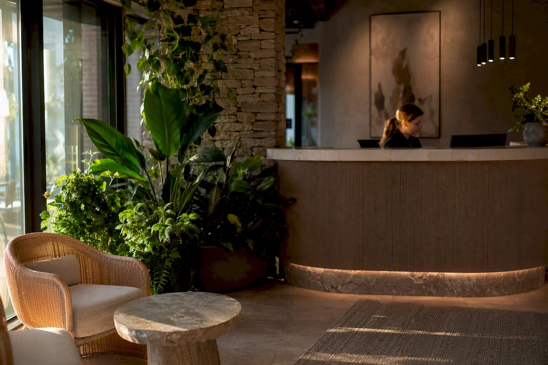
Natural materials extend the same idea beyond plants. Timber veneer, stone, rattan and woven textiles all read as warmer and more human than laminate or painted plasterboard, even when the underlying construction cost is similar. Natural light matters here too: a reception positioned near a window wall or skylight will almost always feel more welcoming than one relying entirely on artificial lighting, regardless of how well that artificial lighting is designed.
The practical caveat is maintenance. Live plants need watering schedules and occasional replacement, and that upkeep has to sit inside the same maintenance plan covering your flooring and upholstery. A dying plant near the front desk undercuts a biophilic design faster than almost any other visible flaw, so factor plant care into your ongoing budget rather than treating it as a one-off purchase.
Designing reception for corporate, medical and hospitality settings
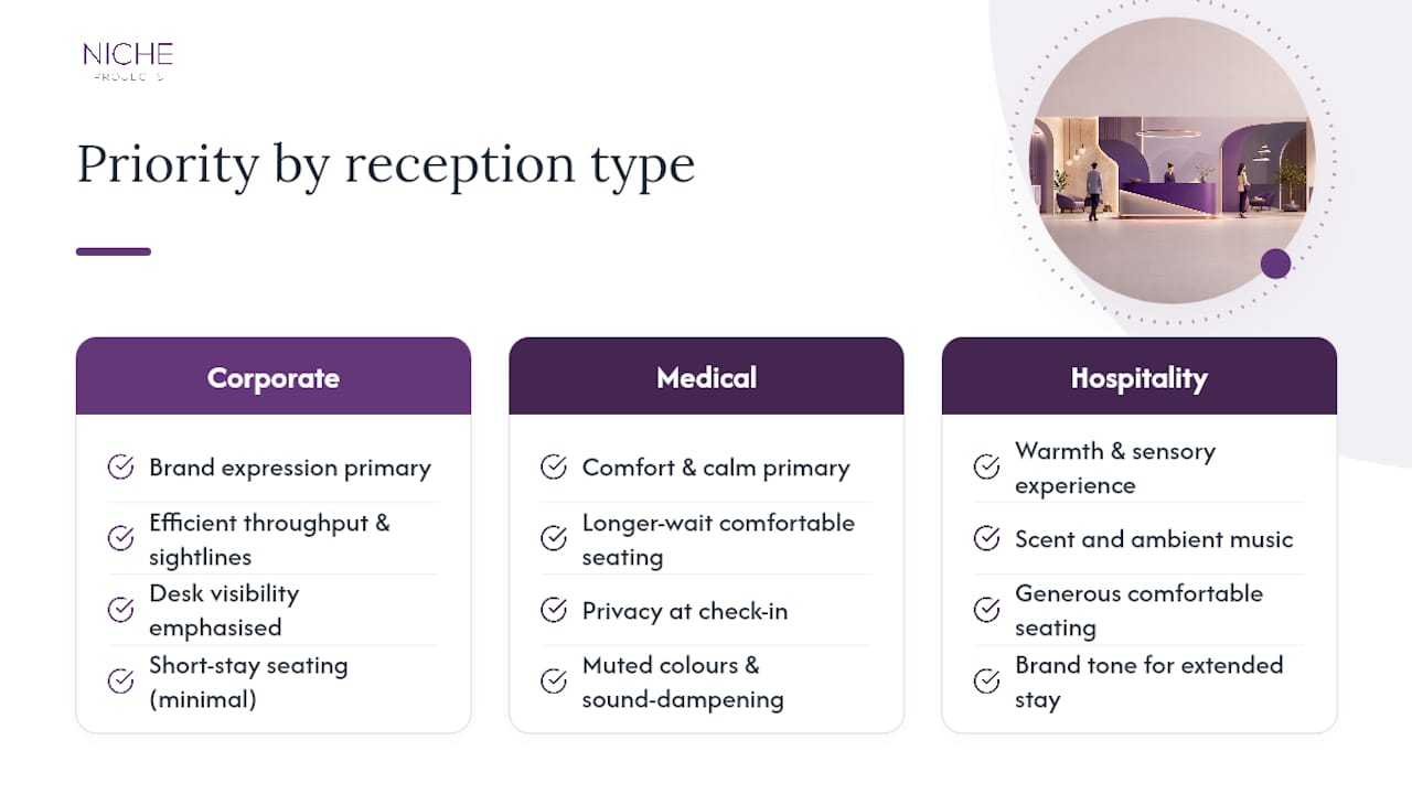
A corporate reception, a medical waiting room and a hotel lobby are solving different problems even though they share a floor plan logic. Corporate reception design generally prioritises brand expression and efficient throughput, since most visitors are there for a scheduled meeting and want to be greeted, signed in and moved on without delay. Desk visibility and a strong feature wall matter more here than deep, comfortable seating, because wait times are usually short.
Medical and healthcare reception areas flip that priority. Wait times run longer and visitors are often anxious, unwell or accompanied by family, so comfort and calm take precedence over brand spectacle. Softer seating, muted colour palettes, sound-dampening finishes and clear, simple wayfinding matter more than a dramatic entry statement. Privacy at the check-in desk also becomes a genuine design constraint, given the sensitive nature of what’s being discussed.
Hospitality reception, meaning hotel lobbies and similar guest-facing spaces, sits closer to the corporate end but with warmth and sensory experience pushed further. Scent, ambient music, and generous, comfortable seating all play a larger role, because guests are arriving after travel and the lobby is setting the tone for an extended stay rather than a twenty-minute meeting.
The common thread across all three is that the underlying design principles, sightlines, zoning, appropriate seating for wait time, don’t change. What changes is which principle gets the most weight, and that decision should come directly from understanding your specific visitor profile before a single material gets chosen.
Sustainable choices that hold up in a reception fit out
Sustainability in reception design isn’t just about specifying recycled materials, though that matters. It’s about choosing finishes and furniture that last, because the most sustainable material is often the one you don’t have to replace in three years. Modular carpet tile is a good example: individual tiles can be swapped when worn or stained, rather than replacing an entire floor.
Low-VOC paints and adhesives improve indoor air quality immediately, which matters in a space where visitors and staff spend concentrated time daily. Certified sustainable timber, recycled content in wallcoverings, and furniture built for disassembly and repair rather than disposal all reduce the environmental footprint of a fit out without requiring visitors to notice a compromise anywhere.
Energy use matters too. LED lighting with good colour rendering has largely made older fluorescent and halogen options obsolete for reception applications, cutting energy consumption while still delivering the warm 3000K to 3500K tone that reception spaces need. Natural light, where the building allows it, reduces reliance on artificial lighting during daylight hours and tends to make the whole space feel better regardless of the sustainability angle.
None of this needs to come at the expense of the brand-led approach covered earlier in this guide. A sustainably specified reception can still carry a strong feature wall, a considered palette and a memorable arrival sequence. The constraint simply shifts procurement decisions toward materials with genuine longevity and lower embodied impact, which tends to align neatly with the maintenance and durability priorities every reception design needs to get right anyway.
Getting your reception fit out off the ground with Nicheprojects
Nicheprojects works across workplace strategy, design and construction delivery, which means the same team that helps you plan your reception zoning also manages the build that gets it built. That matters most at the handover point, where a lot of fit outs lose momentum because the designer’s vision and the construction reality don’t quite line up. Nicheprojects collaborates directly with executives and office managers from the strategy stage through to completion, so the brief you set at the start is the space you actually get.
The most useful first step is downloading the pre-design checklist and working through it before you brief anyone. It captures visitor numbers, security constraints, brand priorities and maintenance capacity in one document, which turns a vague conversation into a clear scope. From there, booking a discovery call or requesting a free office space plan gives you a concrete starting point without committing to anything upfront.